Responsible JavaScript
A presentation at Prairie Dev Con in in Winnipeg, MB, Canada by Jeremy Wagner

RESPONSIBLE JAVASCRIPT JEREMY WAGNER — @MALCHATA — JEREMY.CODES PRAIRIE DEV CON — WINNIPEG, MANITOBA, CANADA — JUNE 2019
Thank you everyone for attending this talk. My name is Jeremy Wagner, and I’m an independent web performance consultant, author, and speaker from Minnesota. I’d like to thank D’Arcy for inviting me back. This is my third Prairie Dev Con, and the event is always great.

I’d also like to extend my thanks to the sponsors for this event, whose assistance makes my appearance at this event—and the event itself—possible.
This talk is based on a series of articles I’m writing for A List Apart called Responsible JavaScript. So if you’re interested in reading those articles, Part I is already published, and Part II will be published in a couple of weeks. If you like this talk, you’ll probably like that article series, so keep an eye out. URLs to this and other materials throughout this talk will be in the conclusion, and I’ll post this slide deck online after the talk. And two things quick before I dive in proper: - 1. Please hold any questions you might have until the end. There should be about 10 minutes left at the end. - 2. There’s an attendee survey for this event, and if you have any feedback on this talk as far as content, subject matter, or whatnot, I’d appreciate it. This is the first time I’ve given this talk and I plan on incrementally improving it as time goes on.

SPHEXISHNESS
To start, I’d like to talk to you about a word I stumbled on some years ago. The word is “Sphexishness”. The word itself is unusual in that it’s a sort of gold-plated adjective that’s not easy to slip into a freewheeling conversation. But, in the context of web development, it has relevance to the actions we perform that we perceive as being thoughtful ones.
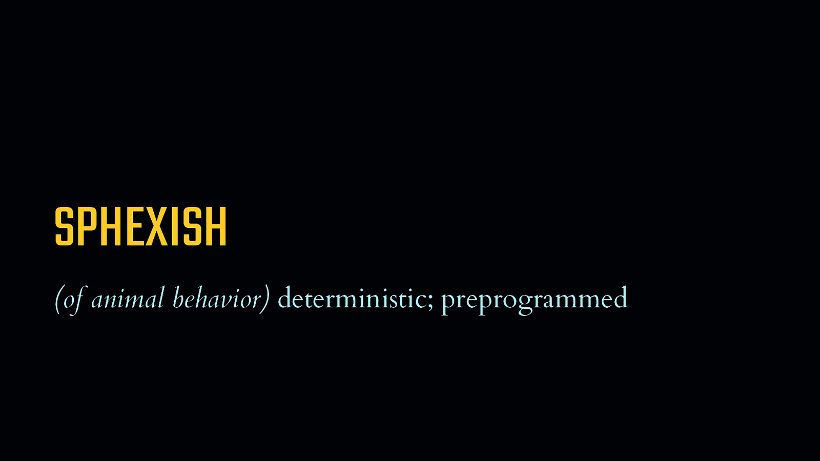
SPHEXISH (of animal behavior) deterministic; preprogrammed
The word “Sphexish” refers to a set of behaviors that are deterministic, or preprogrammed—at least in the context of animals. [SHOW DEFINITION] - It’s a word that refers to repetitive actions that are factory-installed, and rooted deeply in a sort of instinctual firmware. - It’s also a word that’s hard to say if your mouth is still numb from a visit to the dentist. Or if you’ve had a couple drinks. - If you find me at the pub later, don’t ask me to say it out loud.

SPHEX Sphex pensylvanicus
But for all this talk about animal behavior, the origin of the word “sphexish” can be found, as you may have guessed, in the root word “sphex”… [REVEAL SPHEX PENSYLVANICUS] - …which is a genus of thread-waisted solitary digger wasps. [REVEAL WASP IMAGE] - I promise you, that this is a talk about JavaScript, not entomology. - Digger wasps, are, as you would expect, more sphexish than any other animal on Earth. - Because they don’t act simply in deterministic and preprogrammed ways, but they can also be easily manipulated—and be unaware of it.

These wasps provision their larva with live, paralyzed crickets. When they bring their prey back to the nest, they undergo a ritual. Before dragging the cricket into an underground nest, the wasp will leave it outside, and quickly inspect the nest. This is behavior that seems thoughtful at the outset. But it’s really just as mindless as any function you’d write in a programming language. Because, if an observer moves the cricket to another spot before the wasp reemerges, the wasp will once again set the cricket back where it was before, and then inspect the nest—again. This cycle can be repeated endlessly, without the wasp ever wising up to what’s going on.
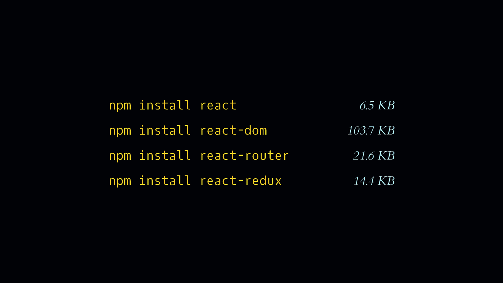
npm install react npm install react-dom
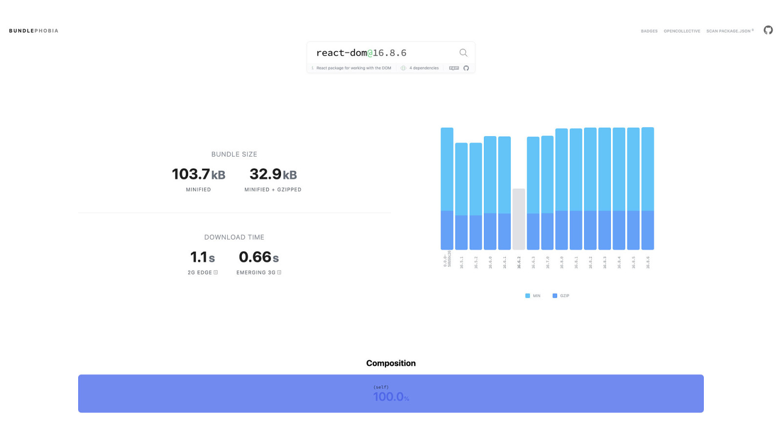
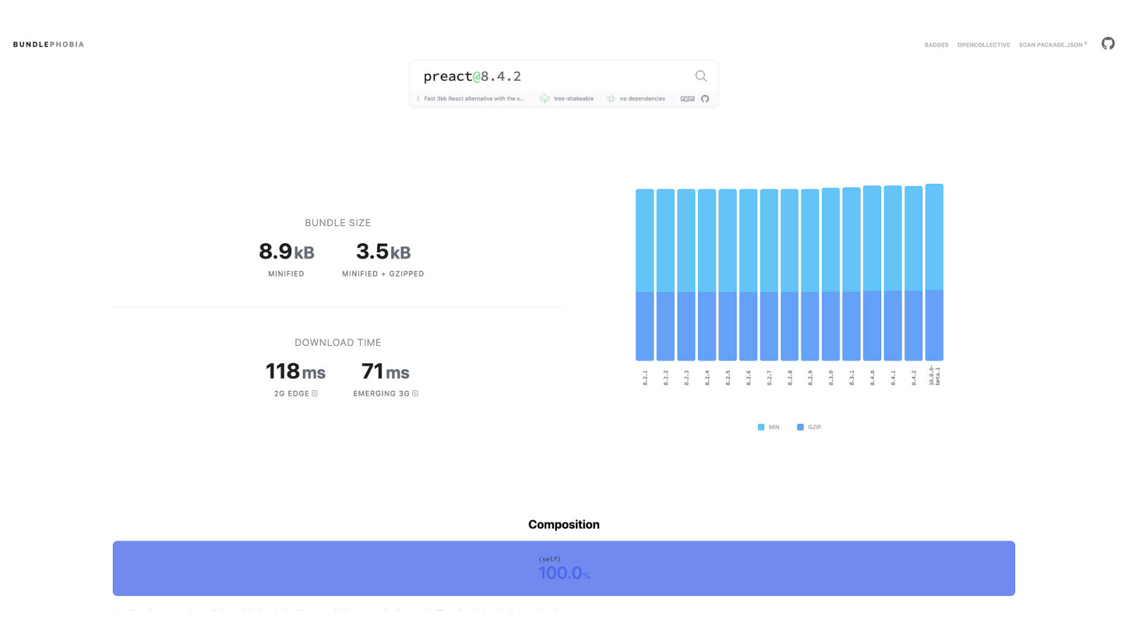
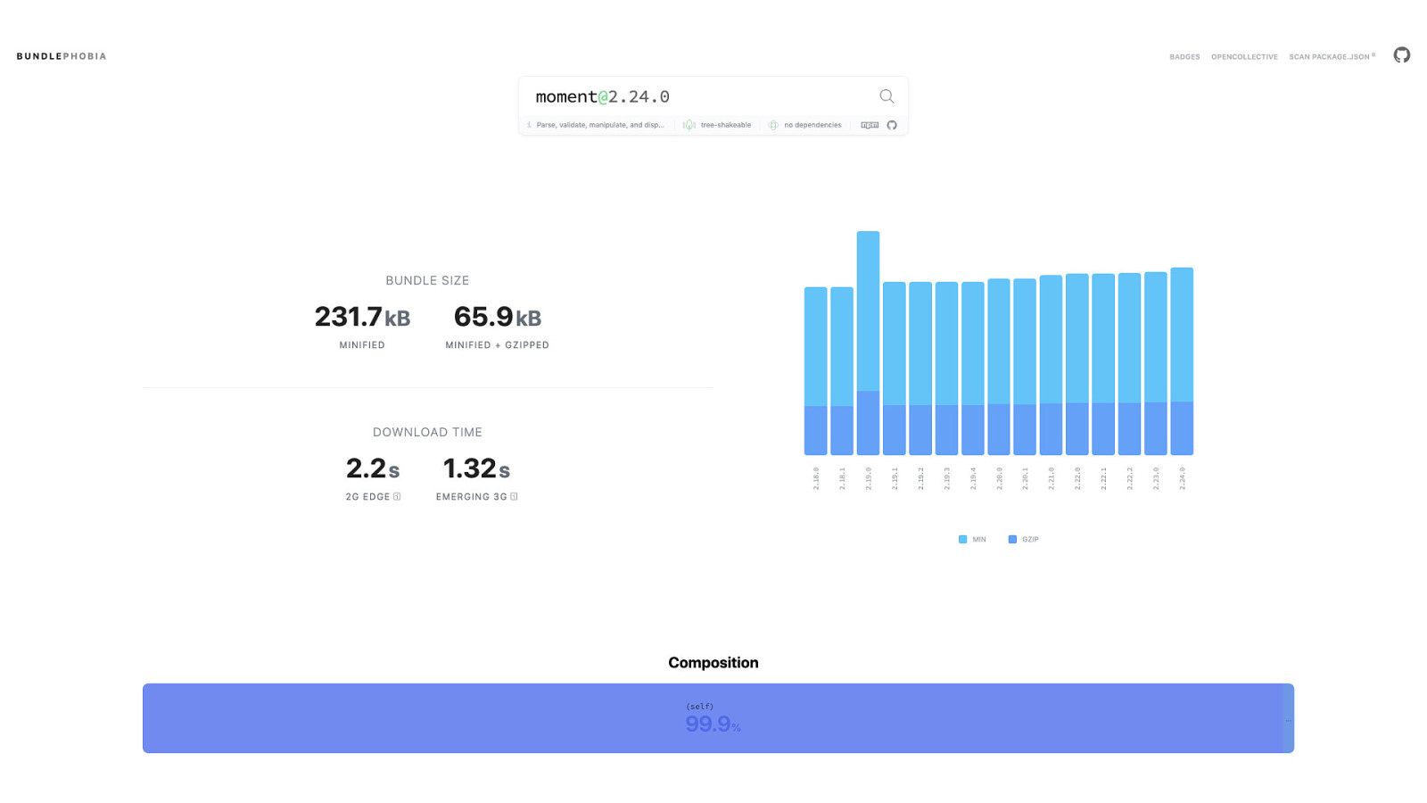
6.5 KB 103.7 KB npm install react-router 21.6 KB npm install react-redux 14.4 KB Now, I didn’t show up here in Canada where everyone is unfailingly nice and hospitable to insult you by calling you mindless. We as developers do know what we’re doing. - But there are decisions involved in our work that we tend to automatically make without question. One such action is, at the outset of developing a new project, we open a terminal. [SHOW REACT, REACT-DOM] - And install a familiar framework with npm. - And then possibly a client-side router for the framework. [SHOW REACT-ROUTER] - And then possibly a state management tool—for the framework, of course. [SHOW REACT-REDUX] - And all the while we’re unaware of—or perhaps have even made peace with—the overhead these conveniences bring.

node_modules/
Incidentally, have you ever waded into the ocean that is the node_modules folder? It’s a place that, if a map was drawn of it during the dark ages, it would have pictures of sea serpents with stern warnings like “here be dragons”. It’s a place we don’t go unless we need to—like if we’re debugging a module that’s gone off the rails. That’s not to say we don’t know what’s in one npm package, but when you’re installing a bunch of them to support your projects, it’s rather difficult to know what’s in all of them.
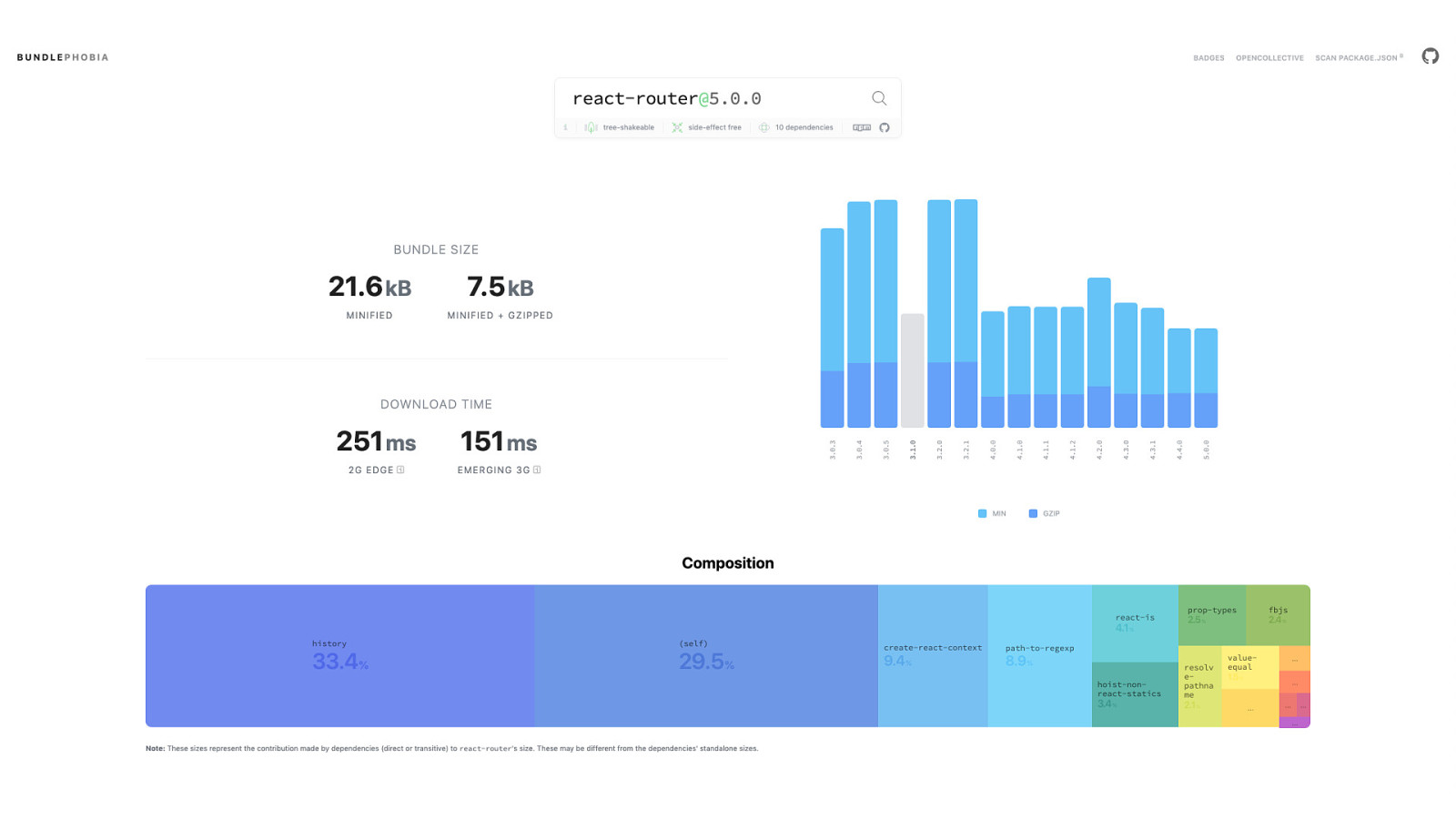
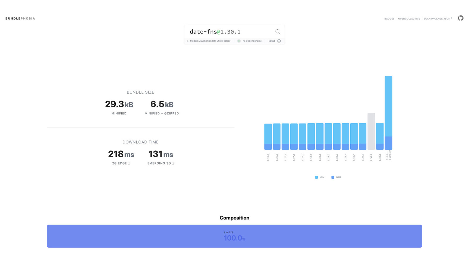
But even so, node_modules isn’t a black box. Tools such as Bundlephobia—shown here—can help us to understand not only what’s in an npm package, but also how much overhead it can introduce into our projects, as wll as how much that overhead could affect the performance of what we build. Those are things worth knowing.
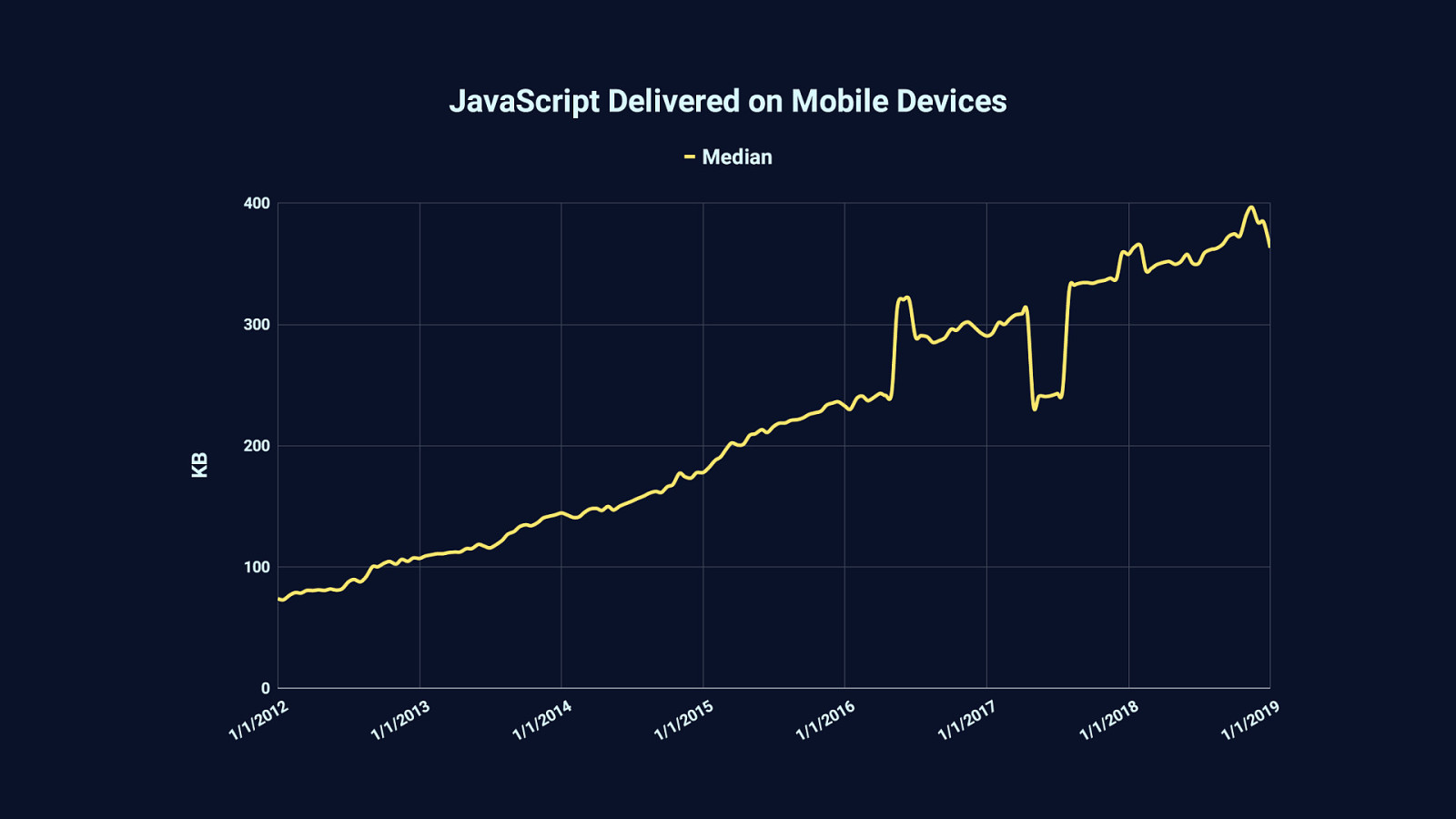
Because in the last 7 or so years—and before that, even—the median amount of JavaScript we serve has only increased. Half the sites you visit today will send less than 375 KB. The other half will send more.
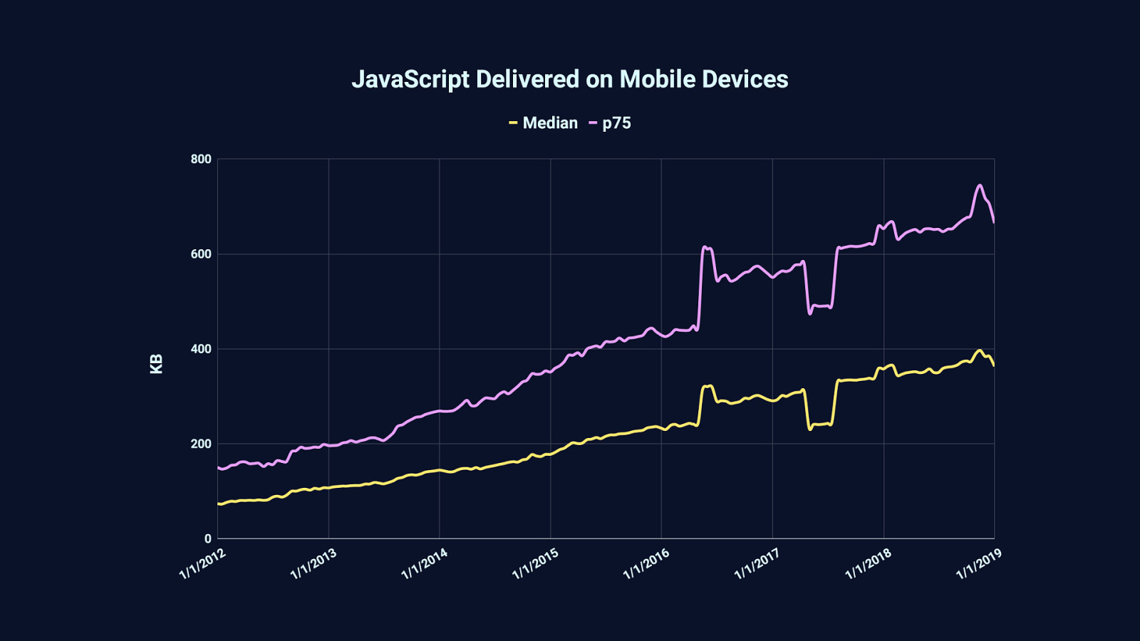
Sometimes a lot more. For example, 25% of websites you visit will send around 650 KB or more of JavaScript…
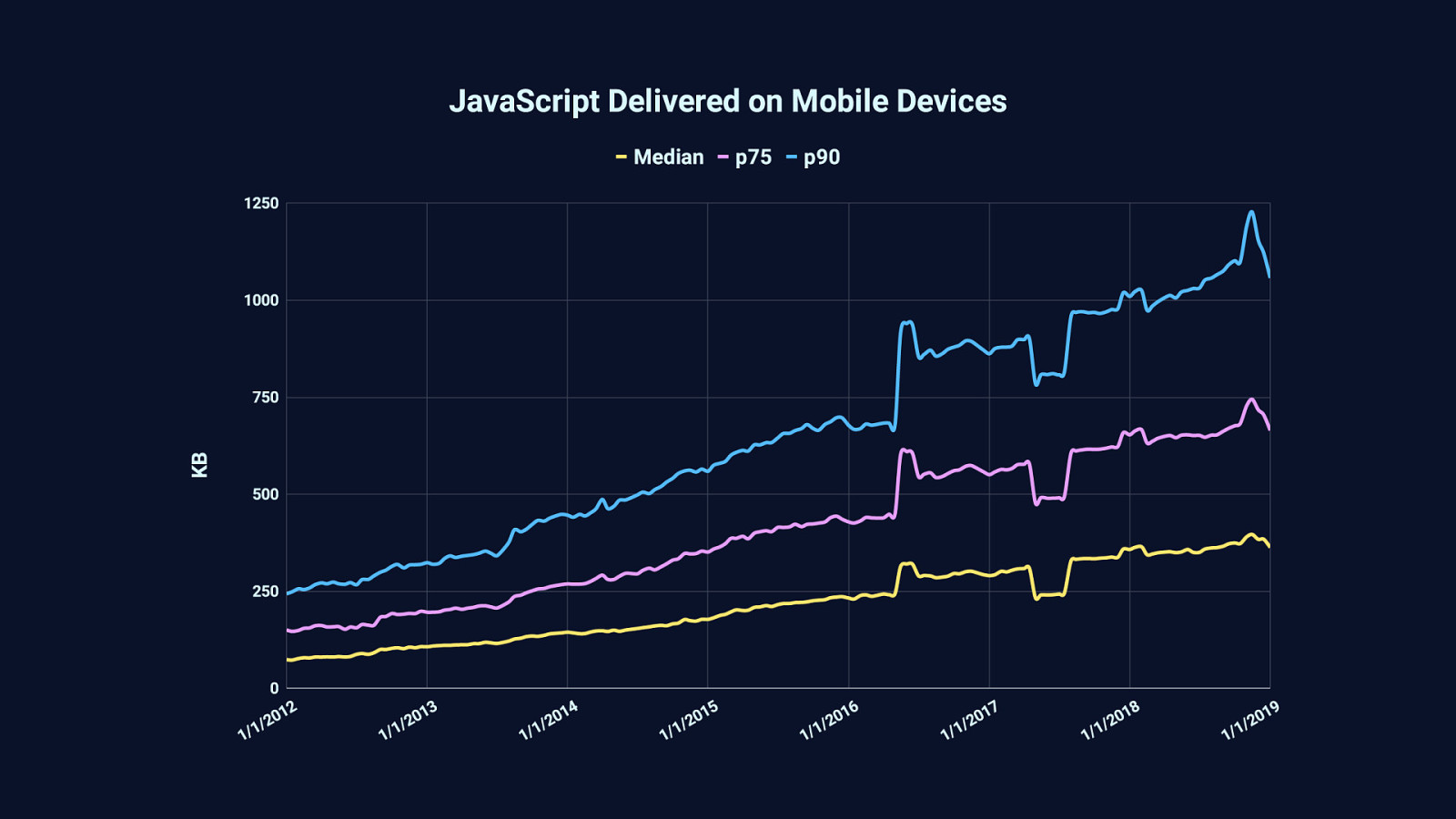
…and 10% of websites will serve even more than that. Meaning that today, 1 in 10 websites you visit will serve over a megabyte of compressed JavaScript. That’s worth noting. This graph is generated from data provided by the HTTP Archive, which tracks the transfer size of JavaScript—which is often compressed… …and while compression is essential to loading performance, it doesn’t change one simple fact about runtime performance: Which is that 3 megabytes of uncompressed JavaScript, even when compressed to a third of that size, gets decompressed on arrival back to three megabytes of JavaScript which browsers must parse, compile, and execute.

If you’re using high-end devices on a low latency and reasonably high bandwidth connection, you probably won’t notice this on all but the worst performing websites. This is the bubble that we tend to live in. Unless you’re performance-minded to begin with, you’re not likely to take notice of a problem if it doesn’t affect you personally. That’s just human behavior.

But on median mobile hardware—such as this affordable, but slower Moto G4 Android phone—chewing through megabytes of JavaScript can make for frustrating experiences. Even on reasonably fast connections.
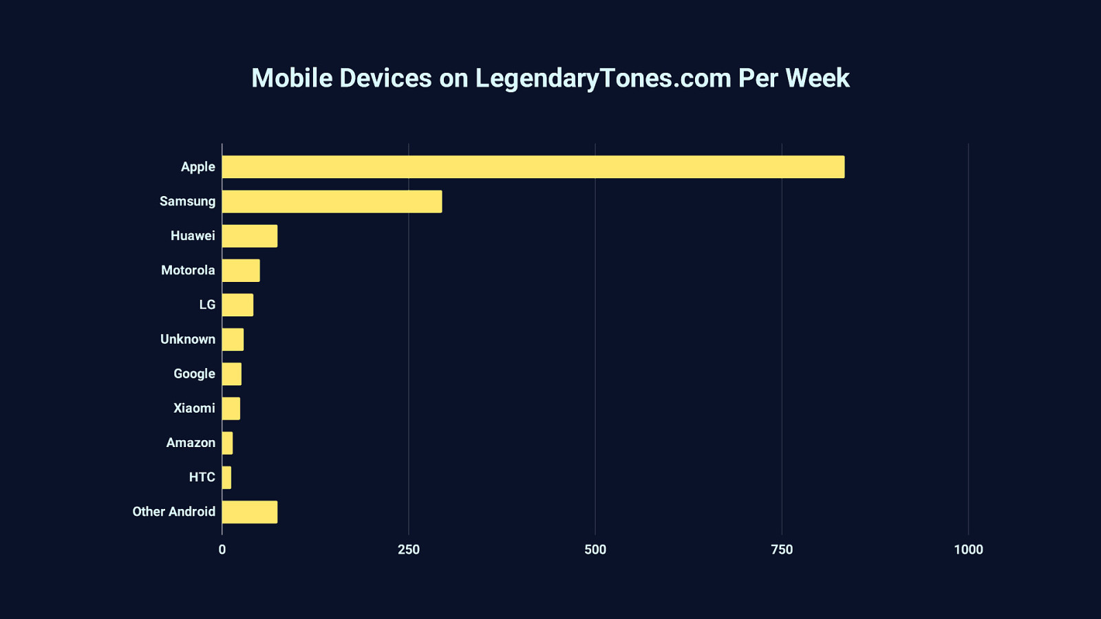
It’s easy to brush aside the long tail of devices like that Moto G4, and assume the majority of your users are on high end devices—and they may be. But I’d hazard a guess that the bigger picture of the devices that access your site are different than what you’ve assumed. For example, take this graph based on analytics from a site I host for a friend on guitars and guitar accessories. This site receives a decent amount of mobile traffic from all over the world, with a fantastically long tail of strange devices I couldn’t fit on this graph. Those devices are grouped together at the bottom under “Other Android”
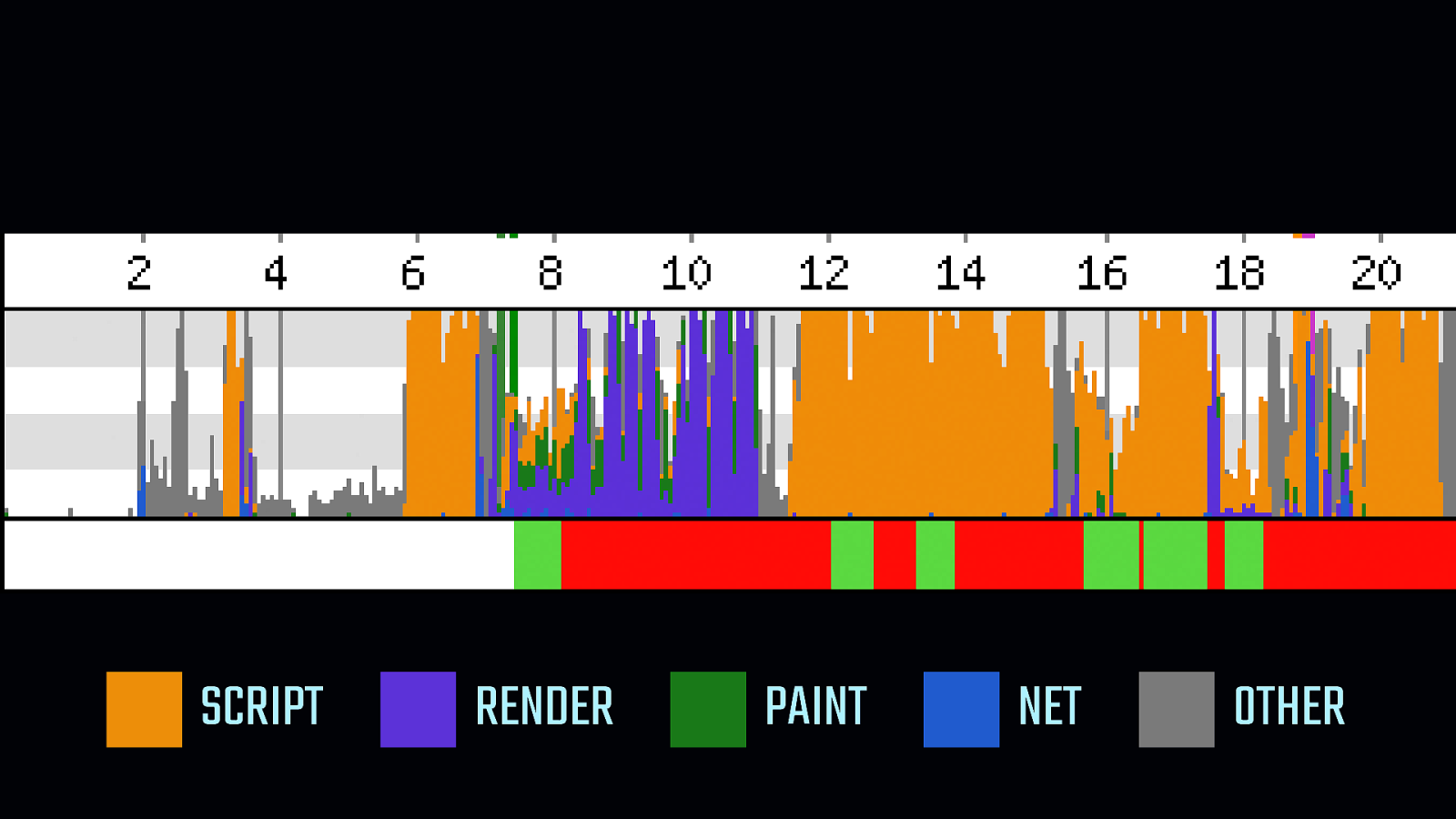
SCRIPT
RENDER PAINT NET OTHER This long tail is important to pay attention to, because when either devices, networks, or both are slow, the web becomes a much less usable, and much less delightful place. [START ANIMATION] - At the bottom of this WebPageTest timeline is the main thread activity indicator. When it’s green, the user is able to interact with the page… - …when it’s red, that’s when the device is unable to do anything. The main thread is totally occupied, browser FPS has cratered, and users are waiting for a hanging device to respond. - The page is totally unusable for 2, 4, sometimes even 6 seconds at a time. Pair that with a slow network, and you can imagine how utterly frustrating the web becomes to use on median hardware. - Collectively, we’re not building experiences that can work in all the places they might need to.

It’s worth repeating that I’m not here to hammer on you for the way you build stuff for the web. Rather, I’m here to help you identify ways you can take what you’ve built and make it better. Because your website is never harmed if it is made to be faster, more accessible, and more usable by the people you want to reach—and beyond.

SPHEXISHNESS
So let’s talk about how we can turn our sphexishness…

ANTI-SPHEXISHNESS
- …into anti-sphexishness, for the good of the web, and for the people who use what we choose to put on it.

PAINT THE PICTURE NOT THE FRAME
There’s an expression I came across a while ago that I really like. It goes… [SHOW TOP LINE] - Paint the picture… [SHOW BOTTOM LINE] - …not the frame.

The phrase comes from an A List Apart article by Eric Bailey about accessibility and UX on the web. (By the way, Eric is someone whose articles and talks are very much worth your time.) The implication of “paint the picture, not the frame” is that we need to focus on what we want our websites to do for people…
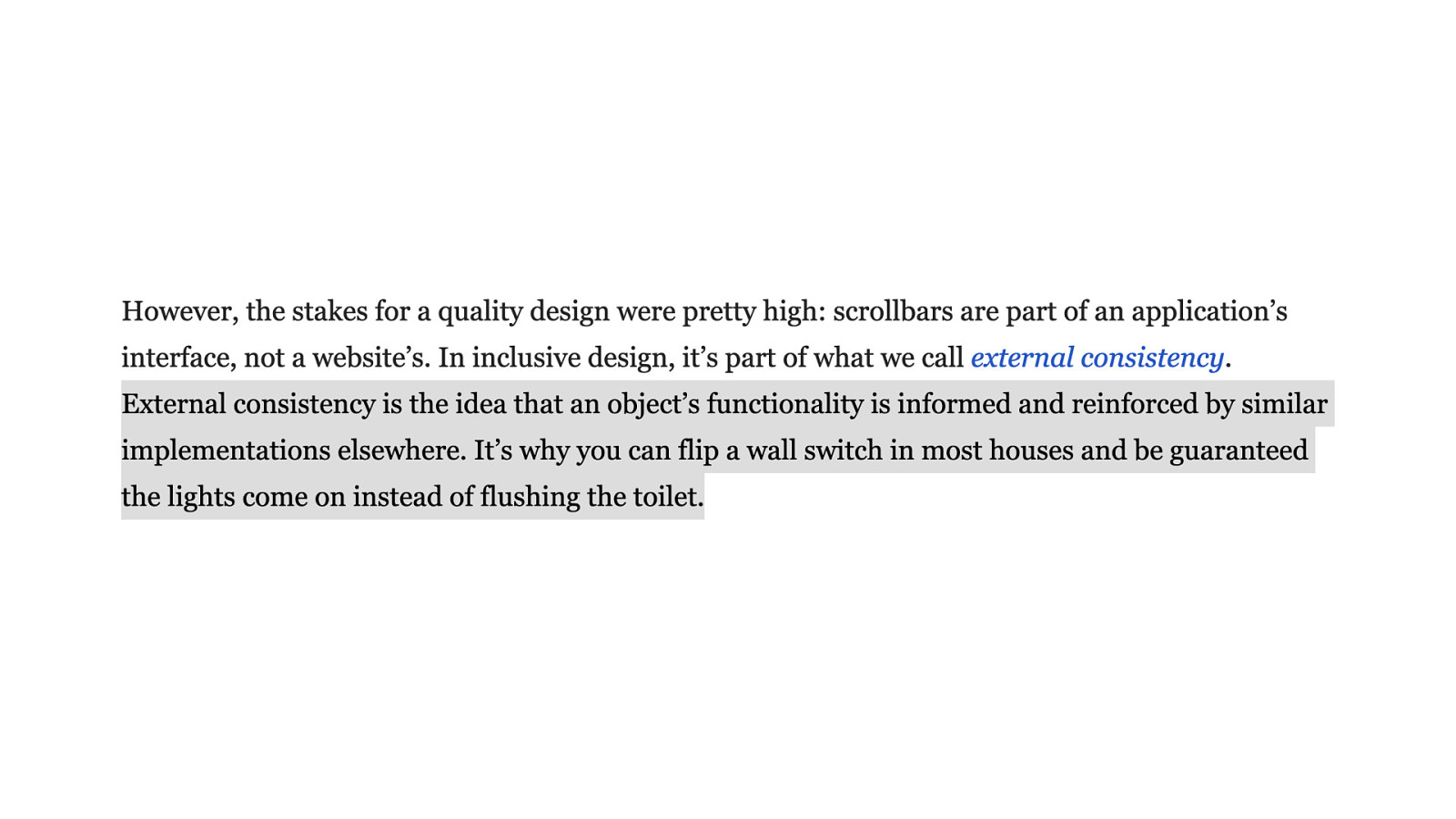
…and that we should not subvert people’s expectations by radically changing externally consistent behaviors, because external consistency is something we expect in many facets of our lives. An example of when external consistency is disrupted might be a website that changes scrolling behavior or scrollbar appearance in a way that isn’t consistent with a person’s expectations, which may impede them in ways we didn’t anticipate. Or, perhaps more importantly, how when we fail to use semantic HTML we inadvertently create experiences that are difficult to use for those who rely on assistive technology.

“Paint the picture, not the frame” is also a wry way to say that we shouldn’t reinvent things things the browser already does very well—like buttons or forms. More often than not, those things just need to be used correctly—or used in the first place.
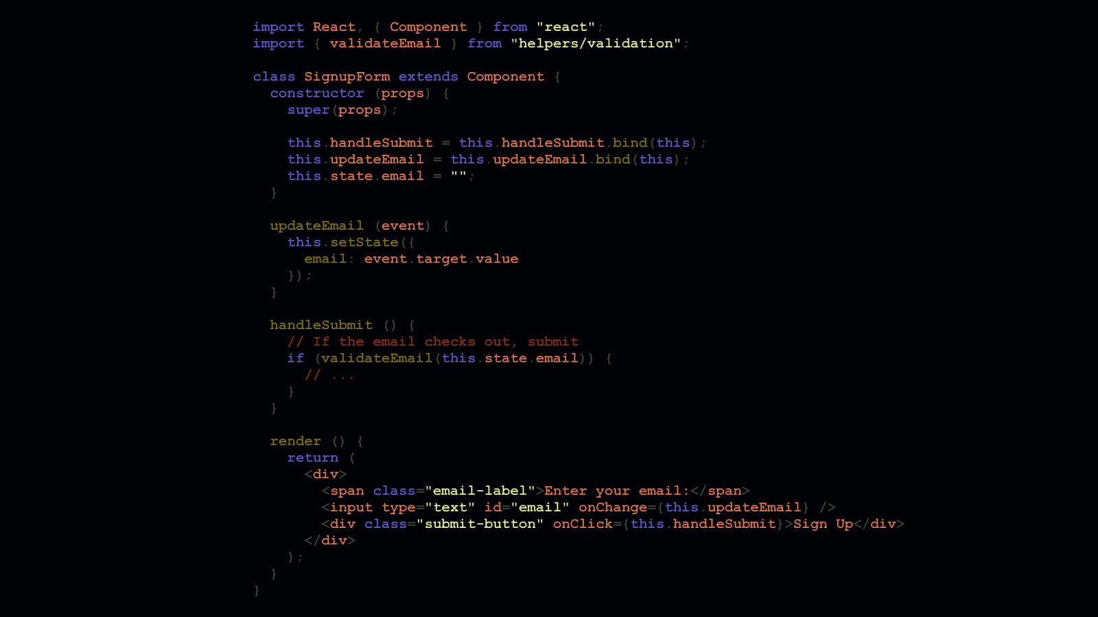
import React, { Component } from “react”; import { validateEmail } from “helpers/validation”; class SignupForm extends Component { constructor (props) { super(props); } this.handleSubmit = this.handleSubmit.bind(this); this.updateEmail = this.updateEmail.bind(this); this.state.email = “”; updateEmail (event) { this.setState({ email: event.target.value }); } handleSubmit () { // If the email checks out, submit if (validateEmail(this.state.email)) { // … } } }
render () { return ( <div> <span class=”email-label”>Enter your email:</span> <input type=”text” id=”email” onChange={this.updateEmail} /> <div class=”submit-button” onClick={this.handleSubmit}>Sign Up</div> </div> ); }
Let’s take this email signup component in React as an example. You’ve probably seen a lot of components like this. The email signup form is a stateful component that has one field, a label for that field, and a submit button. All contained in a single <div>. I’m sure you have opinions on what’s wrong with this code, but the solution doesn’t require more JavaScript. It actually requires less. Let’s dig in and look at the <form> JSX in the render function…
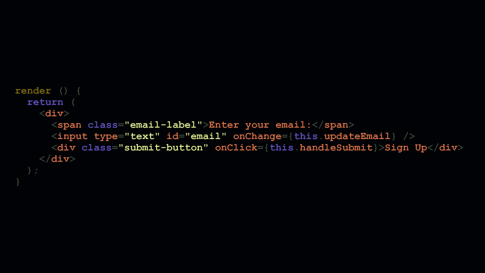
render () { return ( <div> <span class=”email-label”>Enter your email:</span> <input type=”text” id=”email” onChange={this.updateEmail} /> <div class=”submit-button” onClick={this.handleSubmit}>Sign Up</div> </div> ); }
There are three distinct things wrong here: - One, a form is not a form unless it uses a <form> tag. <div>s are semantically meaningless. Now, <div>s are not intrinsically flawed, because they lack semantic meaning by design. They’re developer conveniences for structuring markup. But a form should always use a <form> tag. - Two, when we label form elements, a <label> element should be used with a properforattribute corresponding to anidon an<input>. Doing so lets assistive technologies know that this label corresponds to a specific input. Tying labels to inputs with semantic HTML helps all people interact more efficiently with form inputs. - 3: While<div>s can be coded and styled to behave as buttons, doing so robs them of any semantic meaning they would otherwise have if they were just <button> elements. - And! Here’s a bonus! A<button>’s default behavior within a<form>` element is to submit that form. That means we wouldn’t need JavaScript required to kick off a submit, making it more robust for when—not if—JavaScript fails to run. Now let’s take a look at this JSX if it were refactored to be more accessible.
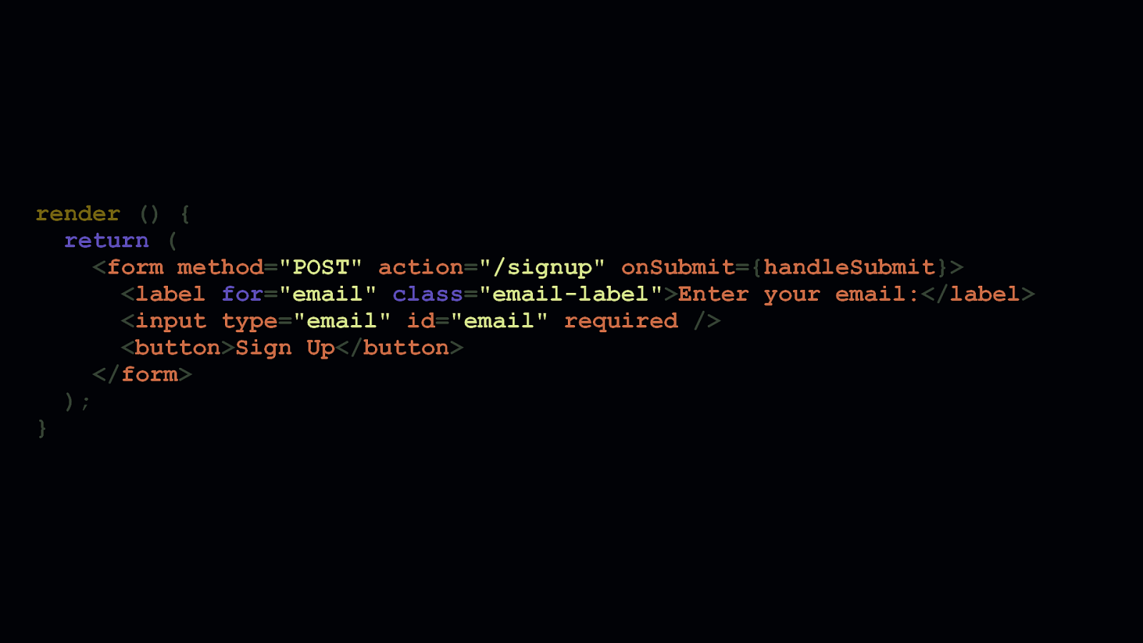
render () { return ( <form method=”POST” action=”/signup” onSubmit={handleSubmit}> <label for=”email” class=”email-label”>Enter your email:</label> <input type=”email” id=”email” required /> <button>Sign Up</button> </form> ); }
This is what the refactored form looks like. Every part of it has semantic meaning assistive technologies can use. It will also continue to work if JavaScript is somehow unavailable—assuming, of course, that the component markup is rendered and sent by the server. Note that the submit handler has been moved from the <button>’s onClick’ event to the<form>’sonSubmitevent. This is the desired behavior for when we want to intercept a form’s submit e vent if we want to enhance this form’s behavior with client-side JavaScript. We’ve also removed thevalidateEmailfunction, and used anemailinputtypein combination with arequired` attribute to leverage the browser’s own email field validation behavior.
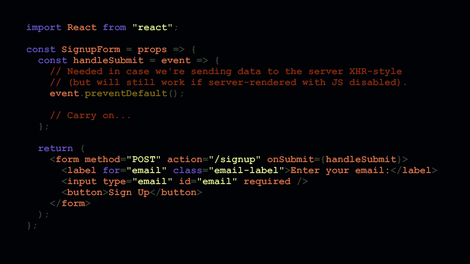
import React from “react”; const SignupForm = props => { const handleSubmit = event => { // Needed in case we’re sending data to the server XHR-style // (but will still work if server-rendered with JS disabled). event.preventDefault(); // Carry on… }; };
return ( <form method=”POST” action=”/signup” onSubmit={handleSubmit}> <label for=”email” class=”email-label”>Enter your email:</label> <input type=”email” id=”email” required /> <button>Sign Up</button> </form> );
Now, here’s the final code, which we’ve refactored from a stateful component to a stateless functional component. Because stateless components don’t extend React’s Component class, the JavaScript output for this component will be smaller when it’s processed by bundlers. Additionally, because the email validation is now handled by the browser, we don’t have to write that behavior in JavaScript. We can count on the vast majority of browsers to provide that behavior for us. Of course, you should always sanitize your inputs on the server. So don’t rely on the client alone to do this. Move your validation logic to the server, rather than forcing the client to load code to do something the browser already can.

Of course, external consistency and semantics aren’t strictly limited to HTML, CSS, and JavaScript. We expect browsers to behave a certain way, and one of the most common subversions of expected browser behaviors is the single page application. As a disclaimer, my personal default is to avoid building sites as single page applications. This isn’t because I hate them, or don’t understand them, or don’t think they can be beneficial. It’s just that, well, the navigation behavior they replace is one that browsers already do so well. It’s a problem that’s been solved very thoughtfully. Loading a client-side router threatens that thoughtful solution.
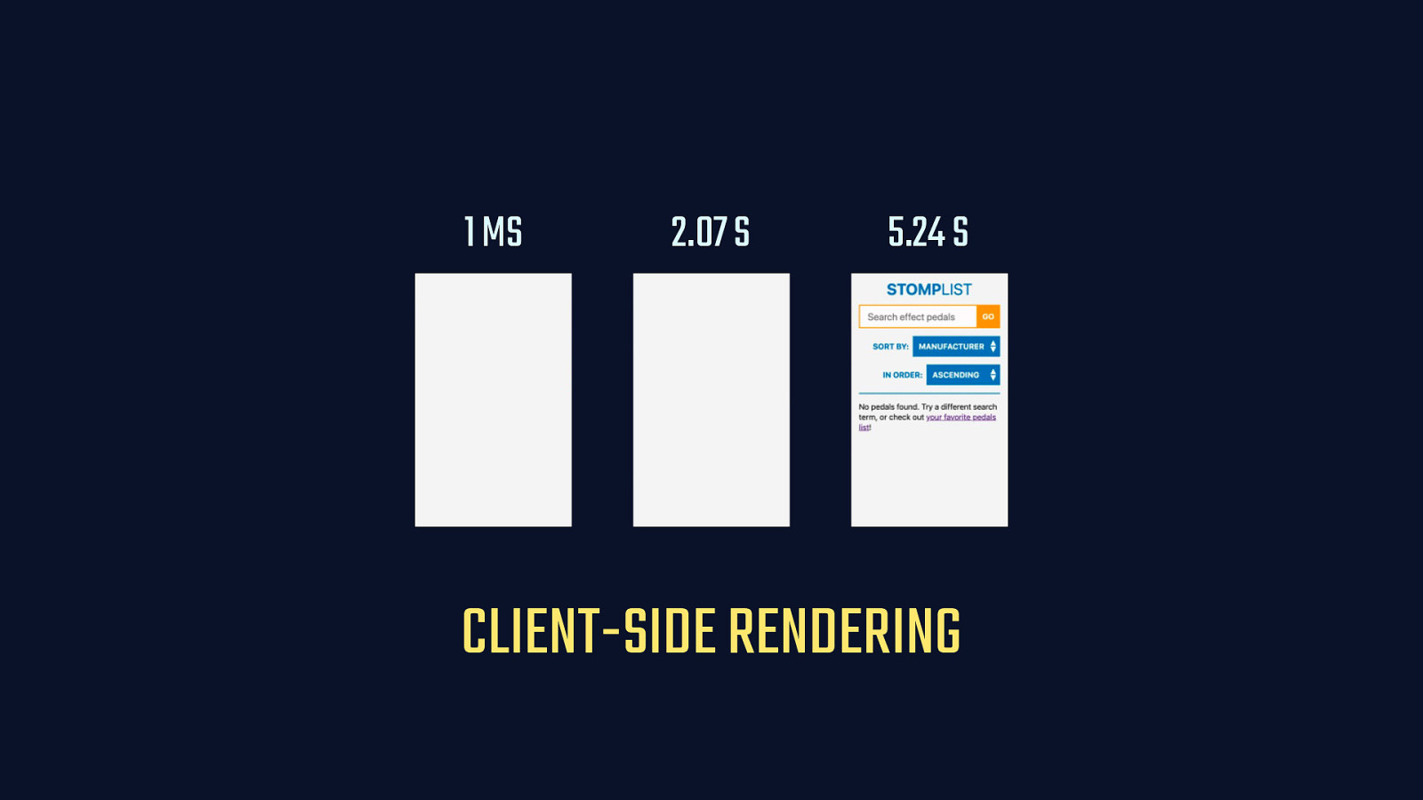
1 MS 2.07 S 5.24 S CLIENT-SIDE RENDERING
When we rely wholly on the client provide this, accessibility can suffer. There’s a whole host of things we can end up reinventing—or worse yet, miss altogether— when we go this route. History must be managed, tabindex and scrolling position must be accounted for, navigation cancelling can fail, and so on. Even if we get client-side routing perfect, rendering performance is affected if that content is not first sent by the server. [SHOW SLIDE CONTENT]
Furthermore, when we fail to send markup on the server, the content of the app is potentially inaccessible if—and when—JavaScript fails or is otherwise unavailable.
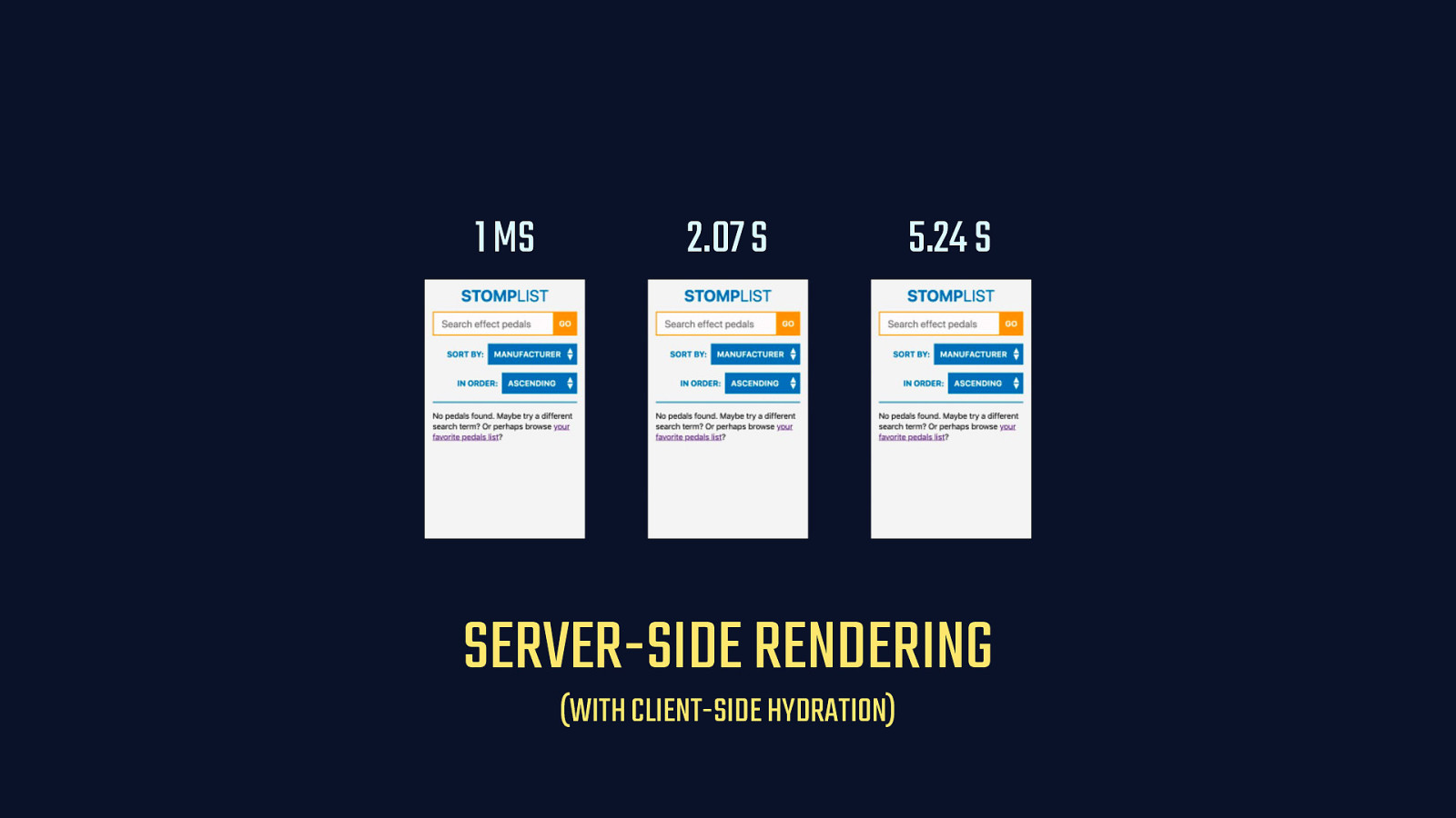
1 MS 2.07 S 5.24 S SERVER-SIDE RENDERING (WITH CLIENT-SIDE HYDRATION)
When we serve content synchronously and from the server, sure, we lose a degree of snappiness. But we get all of that behavior back. And that’s not to say you can never ever use a client-side router in your app. If you provide server-side versions of all your client-side routes, you’ll give people a way to access any part of your app in a way that’s resilient. [SHOW CLIENT-SIDE HYDRATION NOTE]
And then, if you attach your components to that server side markup—also known as client-side hydration—you get a progressively enhanced experience. This gives you the freedom to try different things. Perhaps the authenticated part of your app can be a single page application, or you could allow users to turn opt into clientside routing in their account preferences if they want it.
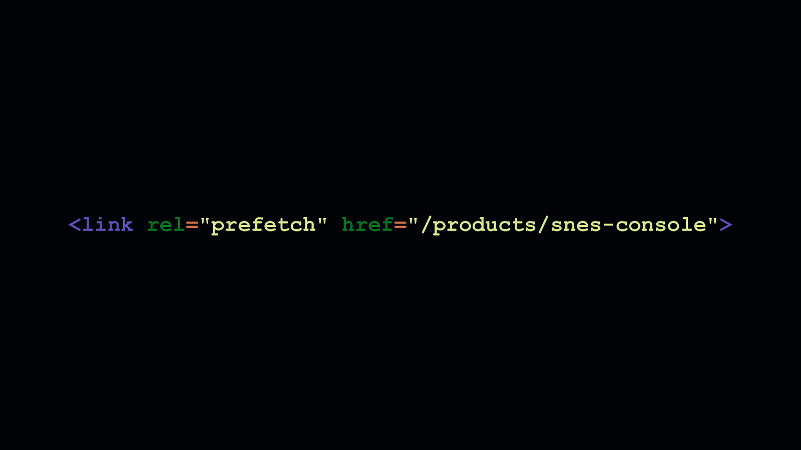
To address the possibility of wasted data, the Google Chrome team offers an extremely small library that prefetches links to other pages as they scroll into the viewport, when the browser is idle, if network conditions are good, and if the user hasn’t stated a preference for reduced data usage.

If that’s still too risky, one solution I’ve come up with is a teeny tiny script called dnstradamus, which prefetches DNS information for outbound links as they scroll into the viewport. It’s not as effective as link prefetching. But it is less risky since DNS lookups are fairly small. For example, Cloudflare’s public DNS resolver issues request packets over UDP that are half a kilobyte or less, and they’re still secured with DNSSEC.

Speaking of wasted data, one of the biggest offenders is media that’s loaded, but goes unseen or unused. It’s such a problem that we’ve often used JavaScript to lazy load this content. [TRIGGER FADE IN]
Most lazy loaders are quite small. My own solution yall.js, for example, is roughly 1.5 kilobytes uncompressed, though some alternatives can be quite a bit bigger.
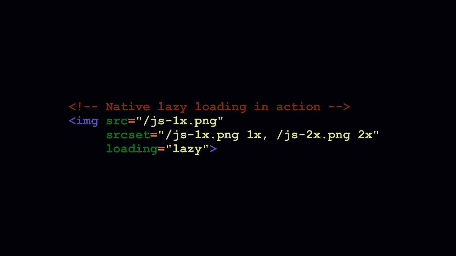
Regardless, none of these JavaScript solutions can be as robust as a native browser solution. Chrome has recently just shipped with native lazy loading, which you can turn on and try out in your chrome flags. With native lazy loading, an additional attribute is added to interfaces for <img> and <iframe> elements. This is the loading attribute. The loading1 attribute takes three values:auto,eager, andlazy. -autodoes what browsers already do today. And, if browser heuristics are optimized in the future, they may intelligently defer the loading of assets depending on network conditions. - A setting ofeagerwill ensure the content is loaded no matter what. - And a setting oflazy—shown here—will ensure that the content is lazy loaded. When theloadingattribute is set tolazy` for images, Chrome will issue a range request for the first 2 KB of an image in order to render the dimensions of the element. Then, using an observer in the browser internals, the content is loaded as it approaches the viewport.
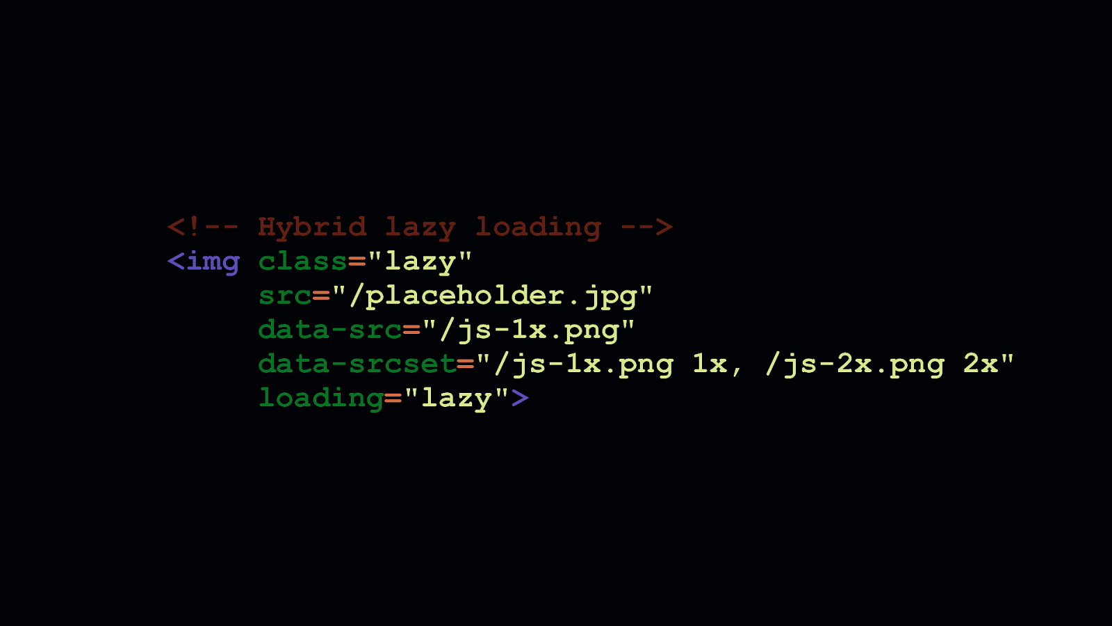
Now because not every browser supports this, some work is necessary to ensure everyone gets a similar experience—that is, if that’s your goal. It’s always possible—and probably easiest—to conclude that only browsers that support native lazy loading should receive that benefit. That’s progressive enhancement at work, and it’s a fine decision. However, you may already be lazy loading content. Therefore, you’ll probably want to make sure that lazy loading benefits are retained for everyone. This markup shows how the common data attribute pattern used by lazy loaders can coexist in the same element with the loading attribute. Unfortunately, in this case, the placeholder will be lazy loaded. Not the final image sources we expect.
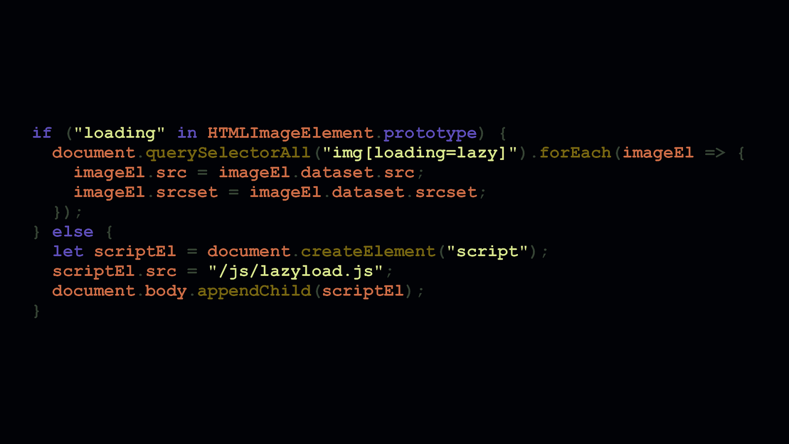
if (“loading” in HTMLImageElement.prototype) { document.querySelectorAll(“img[loading=lazy]”).forEach(imageEl => { imageEl.src = imageEl.dataset.src; imageEl.srcset = imageEl.dataset.srcset; }); } else { let scriptEl = document.createElement(“script”); scriptEl.src = “/js/lazyload.js”; document.body.appendChild(scriptEl); }
Unsurprisingly, feature checking is the way to go. By checking the HTMLImageElement’s prototype object for the loading attribute using the in operator, we can decide what we want to do if native lazy loading is a thing we can use—or if it’s not. If we can use native lazy loading, we can find all image elements with a loading attribute value of lazy and immediately populate the proper src and/or srcset attributes with the final image sources and let the browser take over. If we can’t use native lazy loading, we can fall back to a JavaScript lazy loading solution and fall back to the way we’ve always done it before.
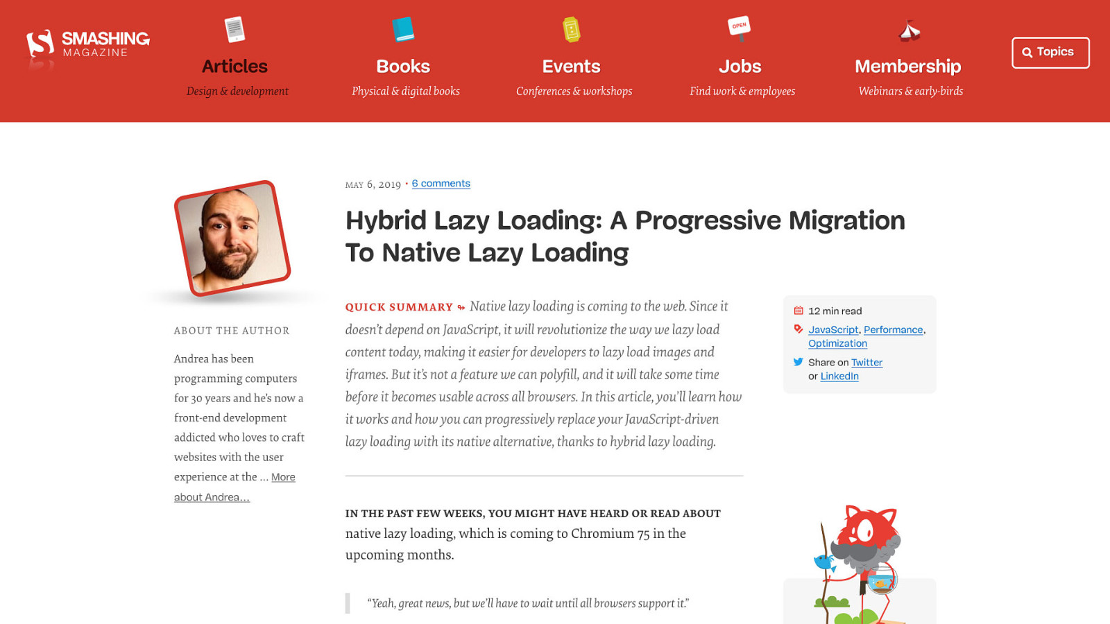
Of course, these things are always more complicated than they first seem. Especially when you start talking about <picture>, elements with multiple <source>s with various candidates for different screen sizes and so on. Fortunately, this Smashing Magazine article on hybridized lazy loading by Andrea Verlicchi shows how you can manage both native and userland lazy loading with thought and care.

BROWSERS GIVE US A LOT OF FREE STUFF
Now I may seem like I’m prattling on a bit with so many examples of what the browser gives us for free. But the point stands: The browser gives us a lot for free. Let’s try to use that free stuff whenever we can, so that we can focus on delivering what works for people, instead of trying to roll everything ourselves—or npm install things that can makes our apps slower and less accessible.
THE TOOLS ARE NOT INFALLIBLE
Now, JavaScript isn’t to blame for the woes of the web. It’s how we use JavaScript, and how the responsible use of it starts with understanding one idea: [REVEAL TITLE CARD] - The tools. Are not. Infallible.

PHOTO CREDIT: JOHN HOEY
There’s one tool we almost all depend on when we need the JavaScript we write for our apps to work everywhere: Babel. While we realize—and appreciate—everything Babel does for us, we often fail to recognize the things it can do to harm performance. Babel is not something to idly slap into a project. We have to know how it works with the ES6 we write. We have to know how to configure it to be fast, because while the diverse needs of the various apps benefit from the defaults Babel presets provide, those defaults may not always produce optimal code for every app. - These defaults are designed to be safe. Not necessarily the fastest.
Those who use what we put on the web benefit from the broadened compatibility Babel provides for our apps. We can reach more people, and provide reasonably similar experiences regardless of the browsers people choose to use. But those users would also benefit if we could simply transpile less code. Because the way Babel transforms code can sometimes add more to our production JavaScript than we might realize.
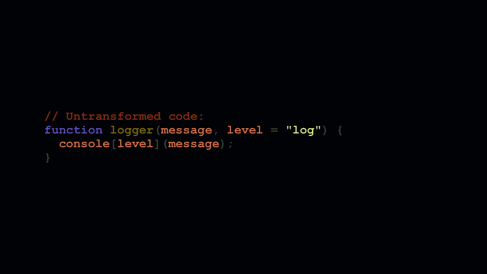
// Untransformed code: function logger(message, level = “log”) { consolelevel; }
Let’s take this little logger function, for example, which accepts a message and level parameter that gets passed to the console object. The second parameter allows us to specify what the log level should be. This corresponds to a console method such as log, warn, or error. This parameter has a default of log, specified in the function’s signature.
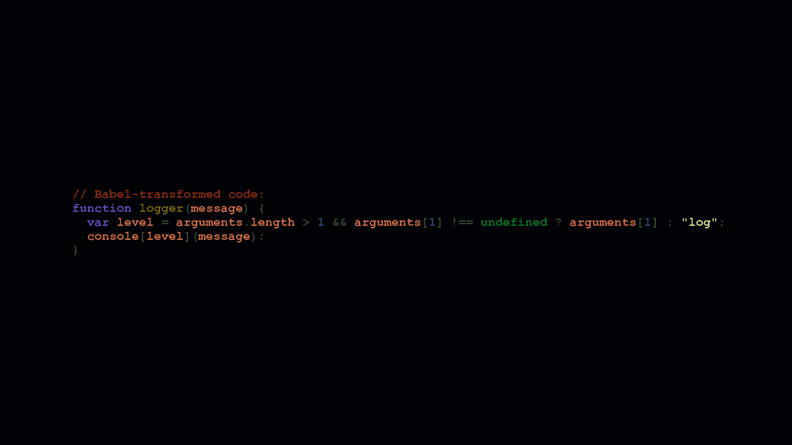
// Babel-transformed code: function logger(message) { var level = arguments.length > 1 && arguments[1] !== undefined ? arguments[1] : “log”; consolelevel; }
Default parameters are very convenient, but regardless of your configuration, Babel often transpiles them with an excessive amount of code. On top of that, this transform is repeated in every instance a default function parameter is used. So if you use them a lot in your client side code, there’s an opportunity right there to ship less JavaScript. If we can’t avoid Babel altogether—and we can’t always—we should consider compensating for stuff like this so we can ship less client-side code—especially if we’re writing libraries people can install.
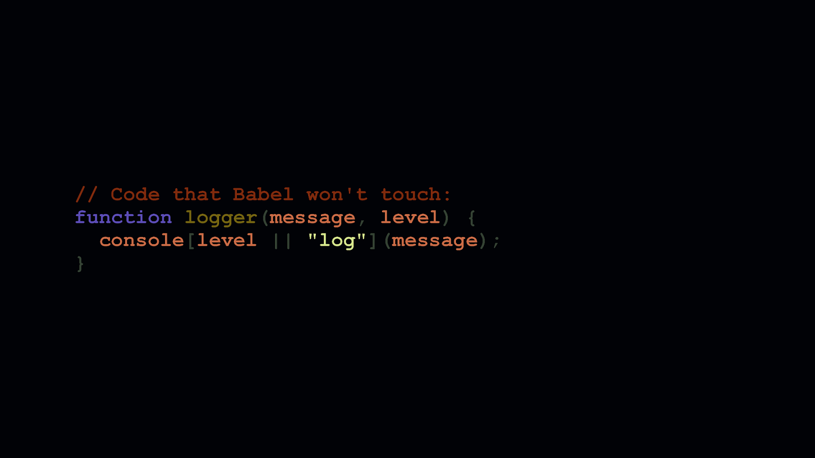
// Code that Babel won’t touch: function logger(message, level) { consolelevel || “log”; }
We can mitigate this transpilation cost by removing the default parameter, and replace it with an OR check. When function parameters are omitted at call time, the value of the parameter is undefined. When we want to assign a default to an “optional” parameter, we simply do a check where the left side of the OR is the parameter itself, and the right side is the default. This means that if the parameter is not supplied, the right side of the OR condition is used. Now this isn’t bulletproof. If you have a parameter whose default is truthy or boolean true, you’ll need to use the in operator within a ternary to assign the proper value. Because if you supply a falsey or boolean false value, the “default” will always take precedence.
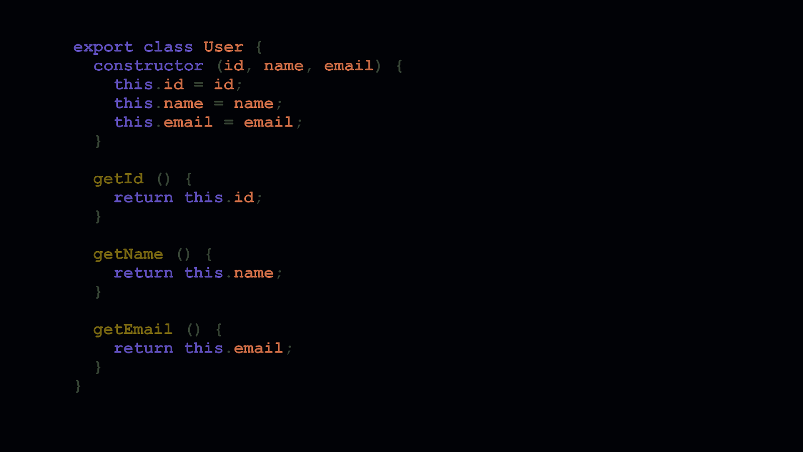
export class User { constructor (id, name, email) { this.id = id; this.name = name; this.email = email; } getId () { return this.id; } getName () { return this.name; } }
getEmail () { return this.email; } Default parameters are just one such feature that gets transpiled by Babel. In some environments, it transpiles ES6 classes, too. ES6 classes are great. It’s a reasonable amount of sugar necessary to turn the prototype model we once used into something that more closely resembles classes as we understand them in other languages.
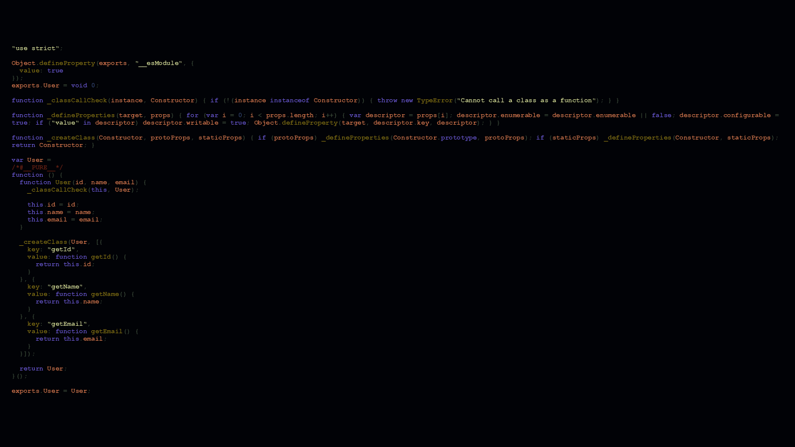
“use strict”; Object.defineProperty(exports, “__esModule”, { value: true }); exports.User = void 0; function _classCallCheck(instance, Constructor) { if (!(instance instanceof Constructor)) { throw new TypeError(“Cannot call a class as a function”); } } function _defineProperties(target, props) { for (var i = 0; i < props.length; i++) { var descriptor = props[i]; descriptor.enumerable = descriptor.enumerable || false; descriptor.configurable = true; if (“value” in descriptor) descriptor.writable = true; Object.defineProperty(target, descriptor.key, descriptor); } } function _createClass(Constructor, protoProps, staticProps) { if (protoProps) _defineProperties(Constructor.prototype, protoProps); if (staticProps) _defineProperties(Constructor, staticProps); return Constructor; } var User = /#PURE/ function () { function User(id, name, email) { _classCallCheck(this, User); } this.id = id; this.name = name; this.email = email; _createClass(User, [{ key: “getId”, value: function getId() { return this.id; } }, { key: “getName”, value: function getName() { return this.name; } }, { key: “getEmail”, value: function getEmail() { return this.email; } }]); return User; }(); exports.User = User;
But lordy, there’s a cost to using them. As you can tell, Babel needs to add a lot to ensure those nice ES6 classes you write get transformed into something that runs everywhere. If you want to mitigate this, you have a couple options. - For one, you could use the prototype pattern and write classes the way we used to in JavaScript before ES6 classes were a thing. It’s not the most convenient way to go, but it does cut down on the cruft Babel adds. - Or, you could use @babel/runtime in combination with @babel/plugin-transform-runtime to deduplicate the helpers Babel adds to make this stuff work everywhere. - Or, if your list of supported platforms can be limited to modern browsers only, you can likely omit Babel altogether from your toolchain. If you can do this, it’s probably your best option. However, if your app makes use of a syntax like JSX, Babel isn’t so easily uninstalled.

PHOTO CREDIT: MINTAREN
How we write our ES6 isn’t the only thing to consider when we use Babel. We also need to know how to configure Babel itself. Suboptimal Babel configurations are tough, because even if you’re relatively well-versed in using it, there’s a lot you can miss. Or misunderstand.

presets: [ [ “@babel/preset-env”, { modules: false, useBuiltIns: “entry”, corejs: 3, targets: “> 0.25%, IE > 10, Firefox ESR, not dead” } ] ]
Polyfilling is something we use Babel a lot for, especially for older browsers. If you’re familiar with @babel/preset-env, this snippet probably looks familiar. However, it’s worth taking a second look at the useBuiltIns option, which we use in concert with @babel/polyfill and core-js to polyfill features based on a browserslist query. When this option is set to “entry”, we must make sure that @babel/polyfill itself is an entry point in our app.
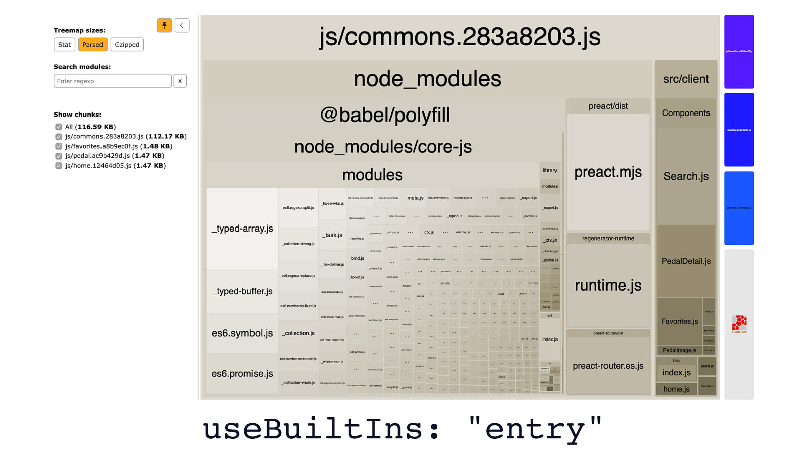
useBuiltIns: “entry”
Doing this adds more polyfills to our app than you’d likely ever need. Here, you can see that the main bundle of this app is almost 117 KB. The majority of it is composed of polyfills.
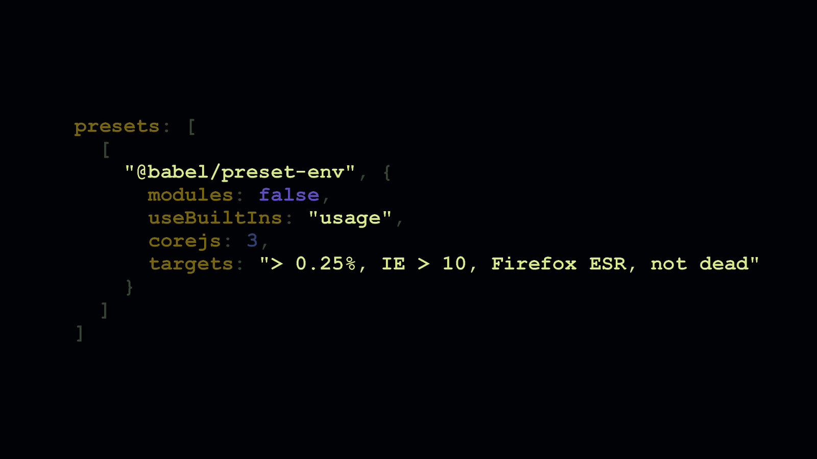
presets: [ [ “@babel/preset-env”, { modules: false, useBuiltIns: “usage”, corejs: 3, targets: “> 0.25%, IE > 10, Firefox ESR, not dead” } ] ]
But, if we make one minor tweak to the useBuiltIns option and change its value from "entry" to "usage", we’re ensuring that @babel/preset-env only adds polyfills based on the code we write. Depending on your project, this can have a pronounced effect on how much JavaScript you ship.
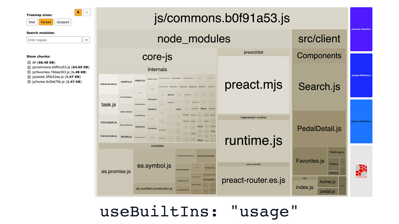
useBuiltIns: “usage”
In the case of this example app, we see that we go from roughly 117 KB of script, to a much leaner 68.5 KB. That’s a 40% reduction. Not too shabby for a quick config change.

presets: [ [ “@babel/preset-env”, { modules: false, useBuiltIns: “usage”, corejs: 3, targets: “> 0.25%, IE > 10, Firefox ESR, not dead” } ] ]
There’s more gains to be had, though. There’s another configuration flag in @babel/preset-env that deserves our attention which activates something called “loose mode”. “Loose mode” is when Babel takes your ES6 code and applies transforms to it that adhere less strictly to the ECMAScript specification. Because the transforms aren’t as rigorous and compliant to the spec, they’re often quite a bit smaller, and work in the vast majority of situations.
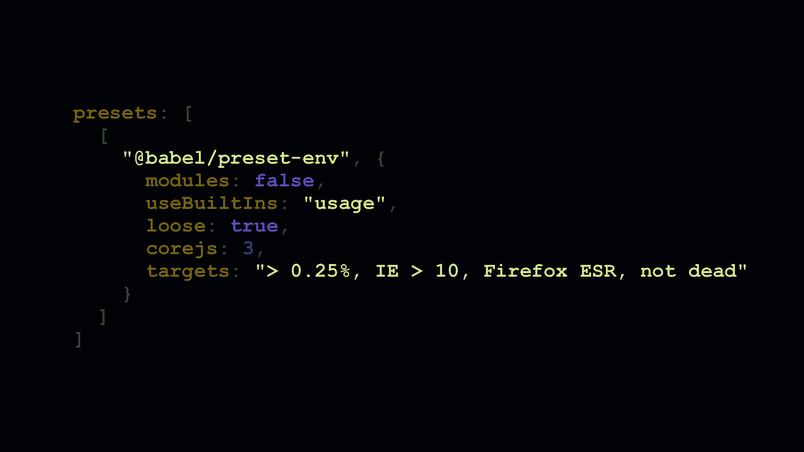
presets: [ [ “@babel/preset-env”, { modules: false, useBuiltIns: “usage”, loose: true, corejs: 3, targets: “> 0.25%, IE > 10, Firefox ESR, not dead” } ] ]
Loose transforms can be applied by enabling the “loose” flag, which is turned off by default.
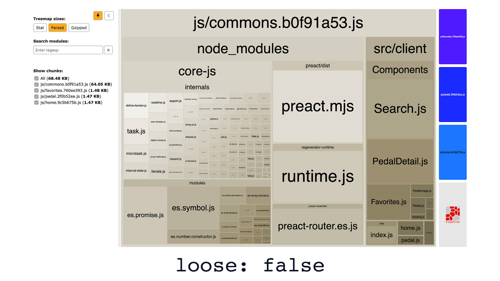
loose: false
Here’s an example app where loose transforms aren’t enabled. It’s pretty small as it is, but it could be a little smaller.
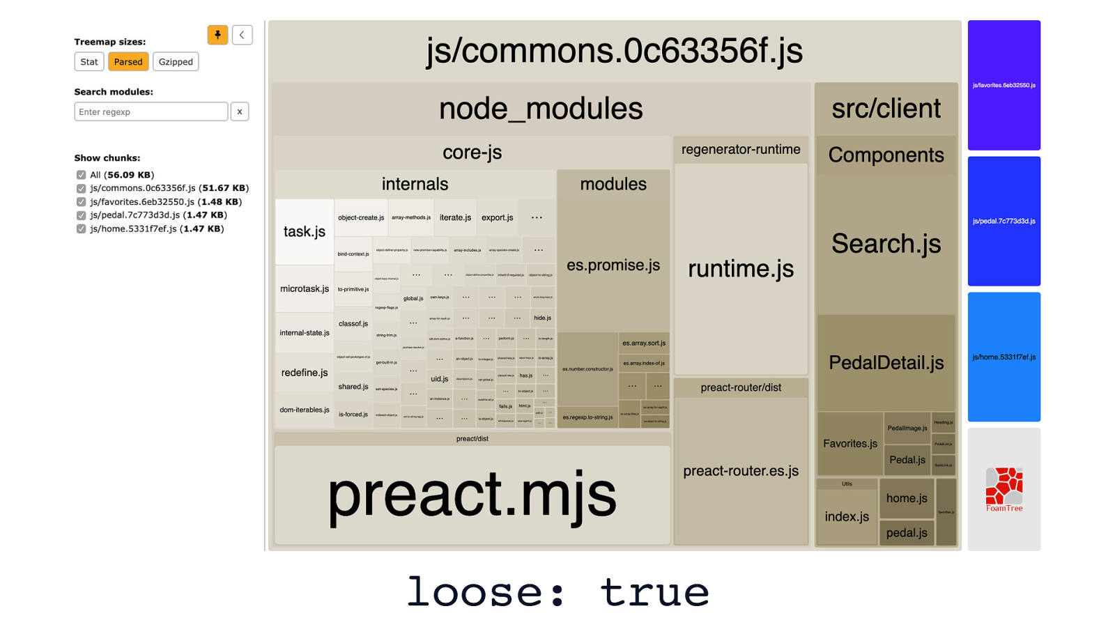
loose: true
Here’s that same example app with loose transforms enabled. It’s about 18% smaller. The app still works as before, although it’ll be a little faster now.
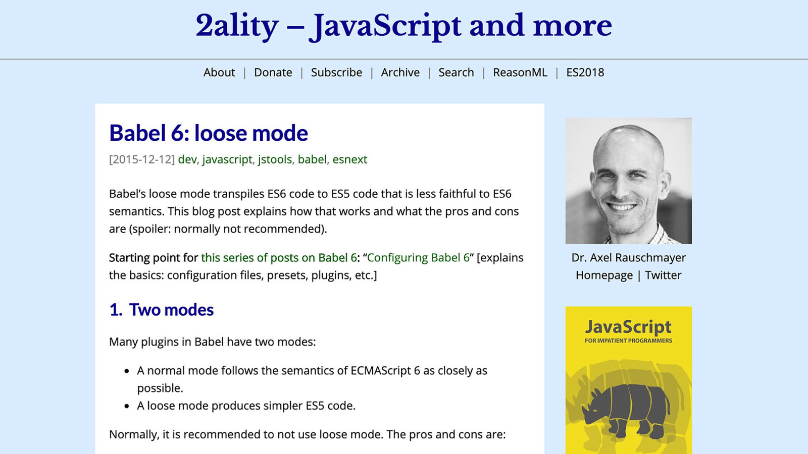
However, loose mode isn’t bullet-proof. This article by Axel Rauschmeyer advises against loose transforms, but whether that advice is relevant depends on your project. The criticism against loose mode is that if you move from transpiled ES6 code to untranspiled ES6 code later on, you could have issues. In my opinion, if the savings are worth it, you can always tackle this potential issue later on in a sprint if you end up making the switch away from Babel. Chances are high, though, that you’ll be using Babel for quite some time, especially as JavaScript continues to evolve. And, if you’re using Babel to transform some non-standard syntax—such as JSX—you’re not likely to ever remove Babel from your toolchain.

DIFFERENTIAL SERVING
However, if you want to serve less code to users today regardless of whether you want to muck around with stuff like loose transforms, “differential serving” is a concept worth considering. Differential serving is this idea that you serve one of two bundles to users: - Bundle 1 would be for those on legacy browsers. This is the bundle you’re already serving that has a bunch of transforms and polyfills necessary for your code to work on legacy browsers. - Bundle 2 would be for those on modern, evergreen browsers. This bundle has little to no transforms or polyfills, depending on what language features you’re using. The benefit is that those on modern browsers will be able to be function with substantially less code.
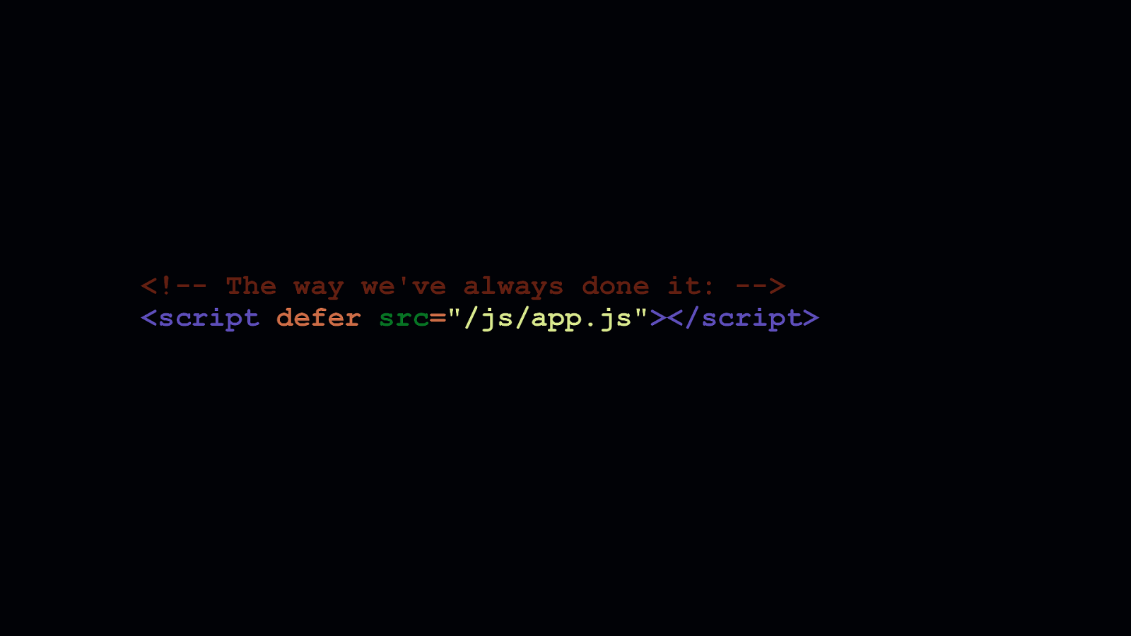
The way we differentially serve JavaScript requires a new way to load these separate bundles. What you see here is the way we’ve always loaded JavaScript since time immemorial.
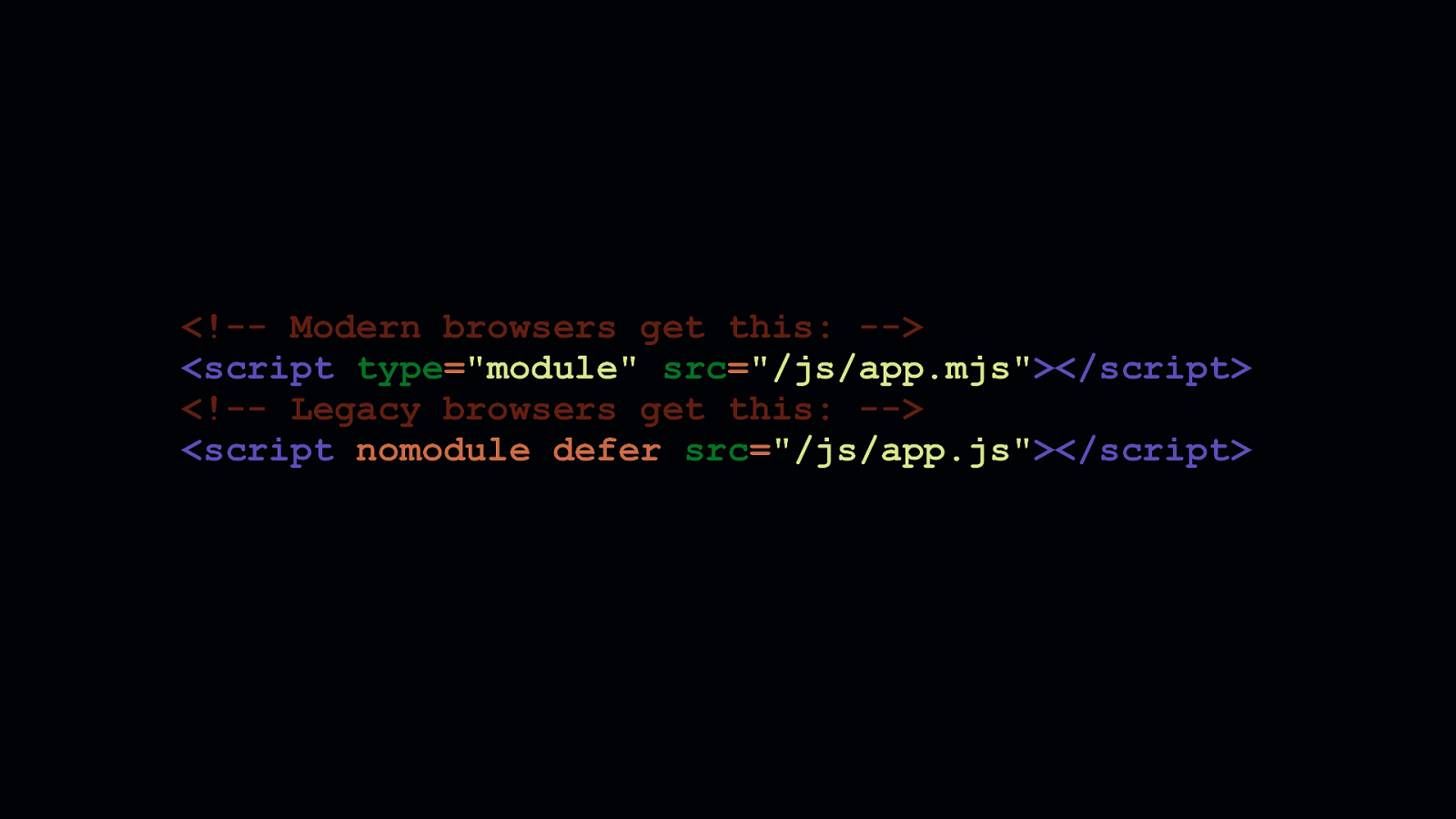
The pattern shown here is how we can load differentially served scripts. The first <script> tag loads a bundle meant for modern browsers. Adding type=module means this script will get picked up by modern browsers, but because legacy browsers don’t understand that type attribute value, they’ll ignore it. The second <script > tag shows how we can load a bundle meant for legacy browsers. The nomodule attribute isn’t understood by legacy browsers, so they’ll download this script anyway. But it, nomodule is understood by modern browsers, which will decline to download scripts request by <script> elements bearing that attribute.
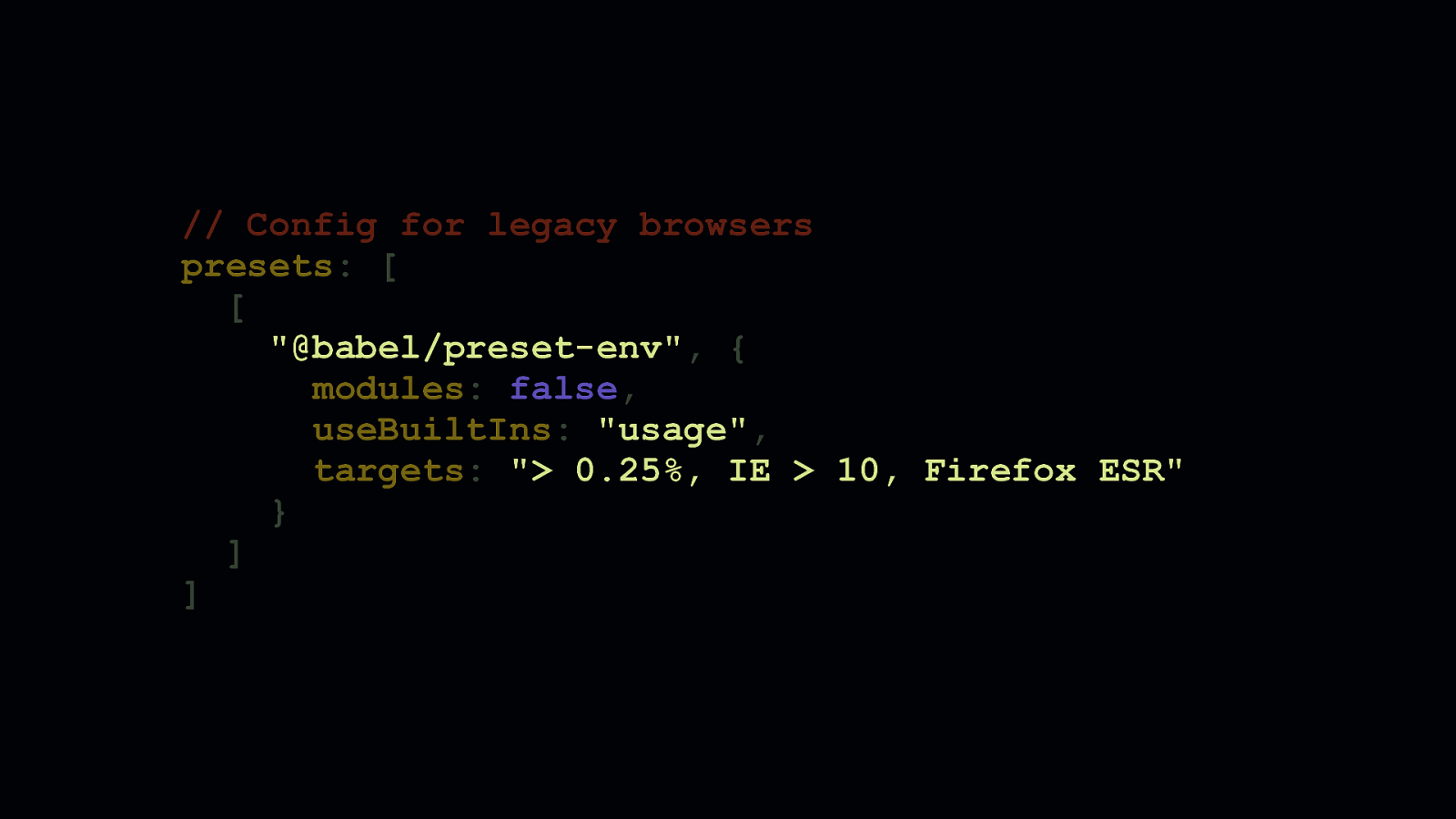
// Config for legacy browsers presets: [ [ “@babel/preset-env”, { modules: false, useBuiltIns: “usage”, targets: “> 0.25%, IE > 10, Firefox ESR” } ] ]
Configuring your toolchain to differentially serve code is another matter altogether, but certainly doable. You need to create two different Babel configurations: one for each bundle you intend to generate. This @babel/preset-env configuration here shows a typical config you’d see in a lot of projects. - We’re targeting older browsers. - We’ve specified modules: false to ensure Babel doesn’t transform ES6 modules into CommonJS, so tree-shaking can work. - We’ve also specified useBuiltIns: “usage” to selectively add the polyfills we’ll need.
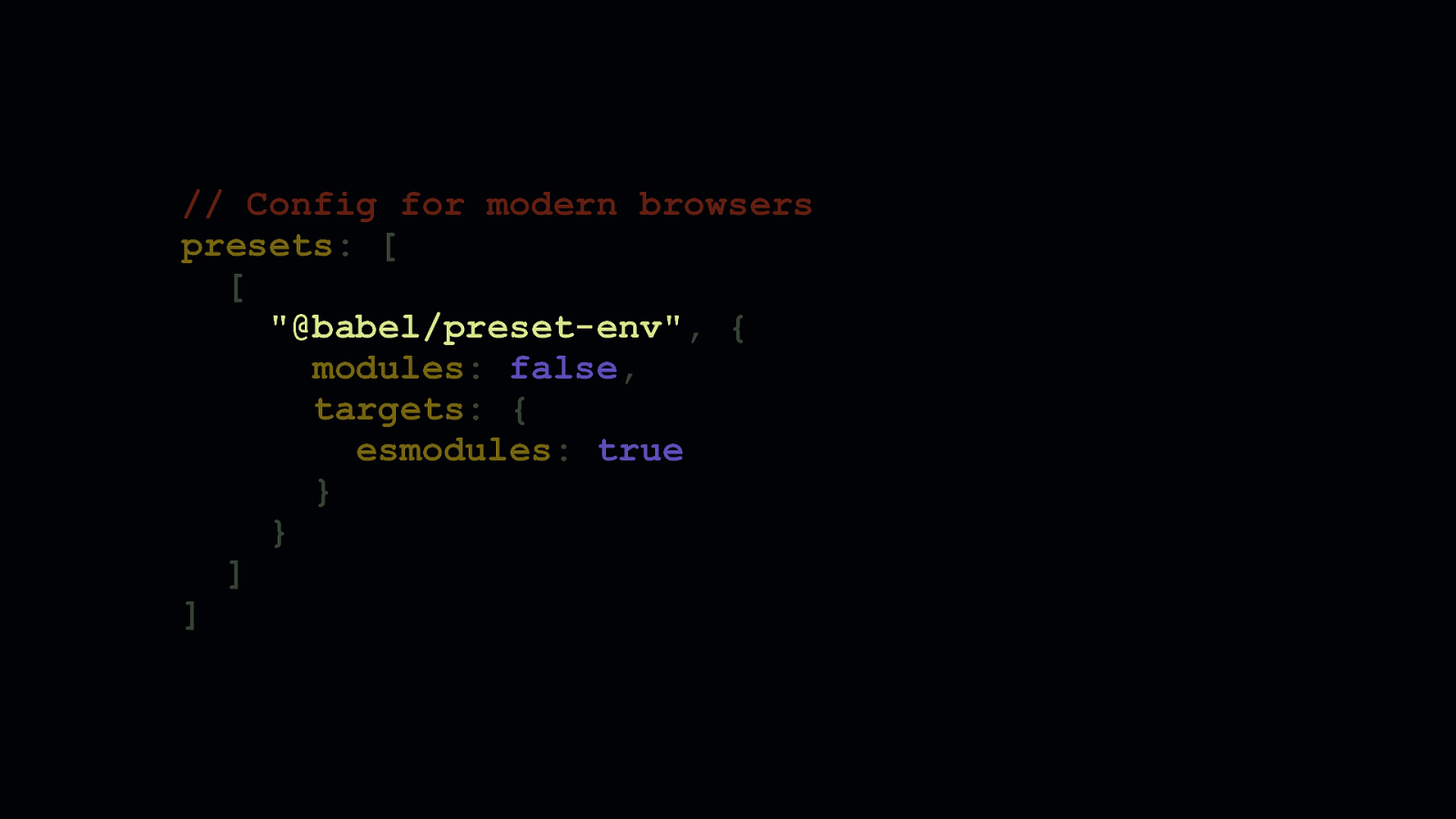
// Config for modern browsers presets: [ [ “@babel/preset-env”, { modules: false, targets: { esmodules: true } } ] ]
Now, this is how you’d configure @babel/preset-env to generate bundles aimed at modern browsers. - You’ll notice that the useBuiltIns option is gone. That’s because in this example, this configuration would be for a project which needs no features polyfilled, because modern browsers don’t need them. Depending on your project and the features you use, you may need to retain that option. Most of the time, however, you probably don’t. - We’ve changed the browserslist query, and instead supplied an option named ‘esmodules’ and set it to ‘true’. Under the hood, this translates to a browserslist query that includes all browsers which natively support ES6 modules. This is convenient, because if a browser supports ES6 modules, it also supports other modern features, such as async/await, arrow functions, spread syntax, and so on.

// babel.config.js module.exports = { env: { clientLegacy: { presets: [ [ “@babel/preset-env”, { modules: false, targets: “> 0.25%, IE > 10, Firefox ESR” } ] ] }, clientModern: { presets: [ [ “@babel/preset-env”, { modules: false, targets: { esmodules: true } } ] ] } } };
- Now here’s how both configurations can live together in the same file. Babel 7 gives us a nice way to group multiple configs under an
envobject. Then, in our bundler configuration, we can point to these separate configurations.
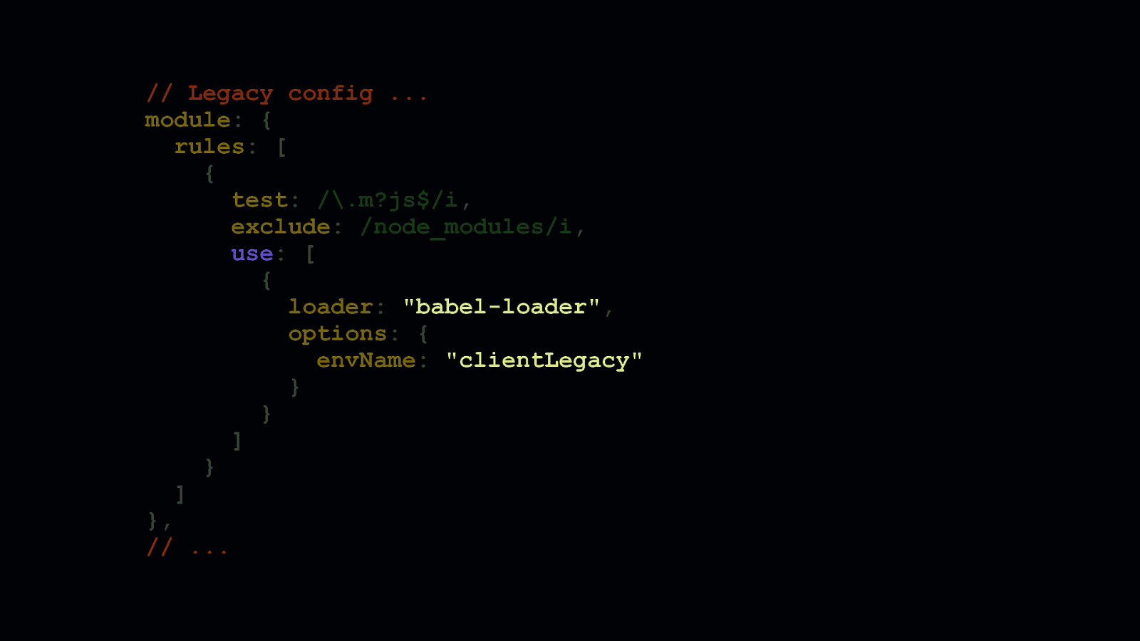
// Legacy config … module: { rules: [ { test: /.m?js$/i, exclude: /node_modules/i, use: [ { loader: “babel-loader”, options: { envName: “clientLegacy” } } ] } ] }, // …
In webpack, this is how you probably use babel-loader to match script files to ensure they get processed by webpack. Note envName option in babel-loader’s options. This points directly to a configuration in the env object in the Babel config shown in the previous slide. Then, using webpack’s multi-compiler mode which allows you to export multiple configuration objects in an array, you can create a wholly separate config to generate a modern version of your bundled code.
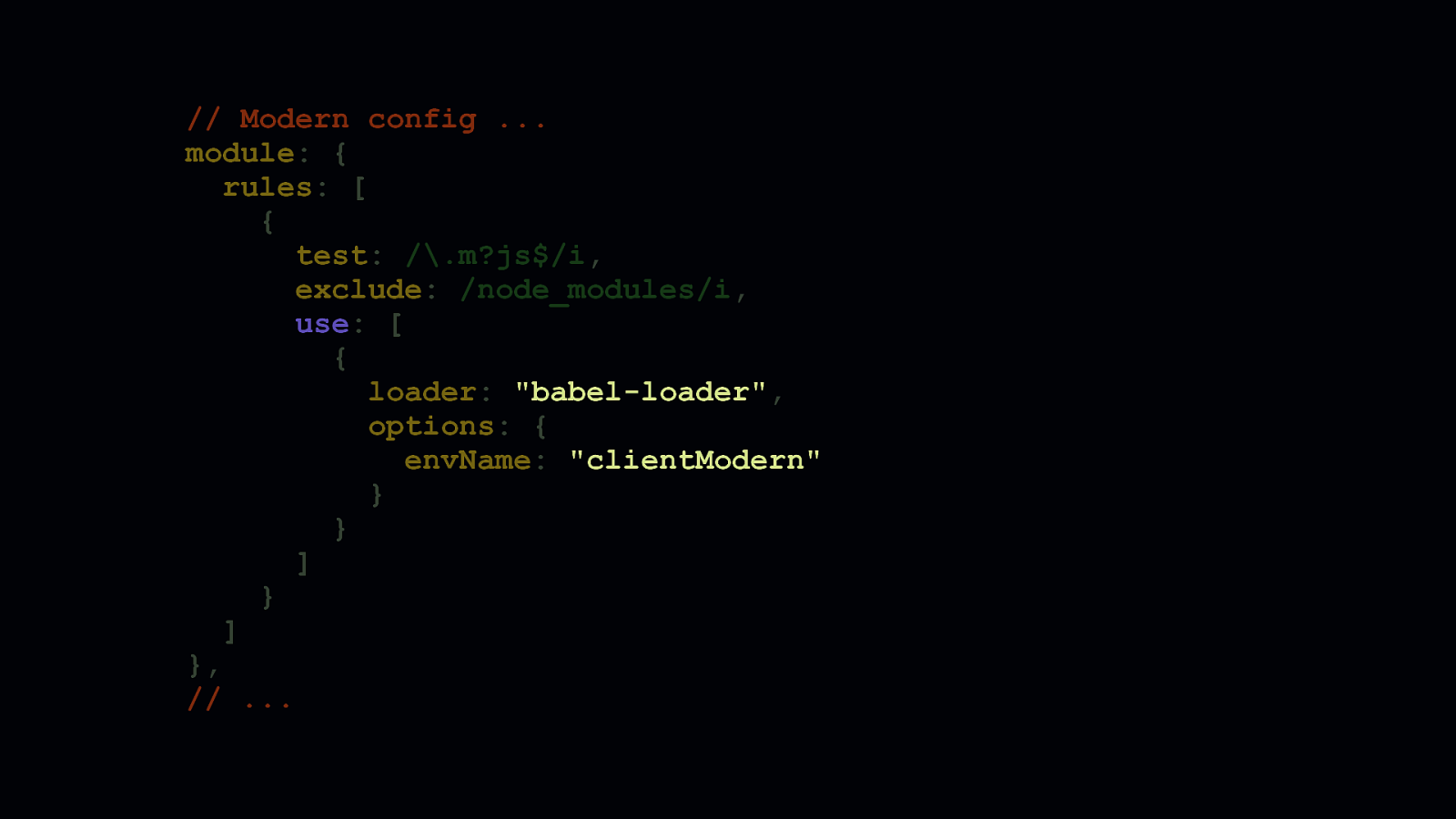
// Modern config … module: { rules: [ { test: /.m?js$/i, exclude: /node_modules/i, use: [ { loader: “babel-loader”, options: { envName: “clientModern” } } ] } ] }, // …
In your babel-loader configuration in the modern fork of your webpack config, you can then point to the clientModern babel config to generate a smaller version of your code modern browsers can use.
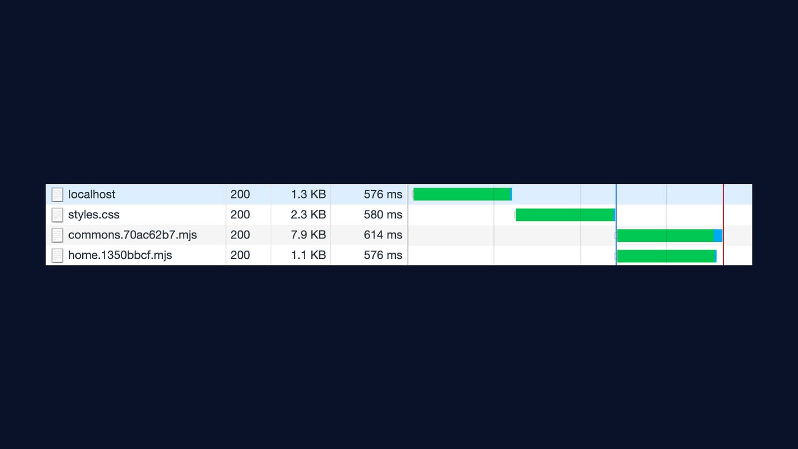
When you get this working, it feels pretty great. You can see in this screenshot of Chrome’s DevTools, that bundles with an extension of MJS are loaded. Just a quick note on the MJS extension: Using this extension isn’t necessary, but it makes it easier to determine which version of your code is legacy, and which isn’t. If you decide to serve MJS files, make sure that your server is serving them with the correct content type of text/javascript. Failing to do so will cause conforming browsers to fail to process your modern bundles.
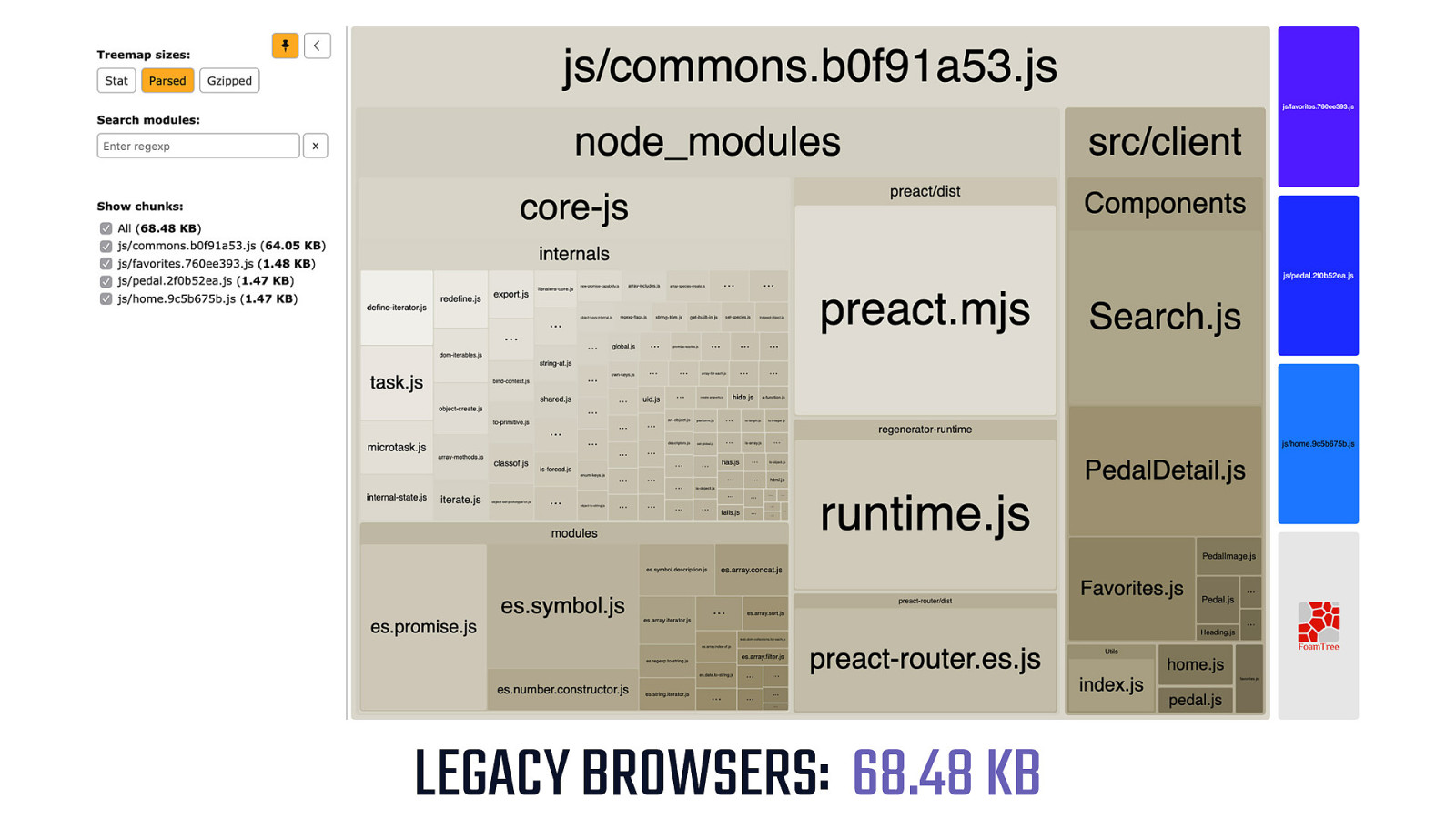
LEGACY BROWSERS: 68.48 KB - The size difference between legacy and modern versions of your bundled code depends on the project. I’ve seen some projects only get marginal gains to the tune of 5 or 10 percent. But I’ve also seen some projects where the gains are much, much more. Sometimes as high as 90 percent, though that’s fairly rare. This is a webpack bundle analysis of an example app’s legacy bundle. It’s already pretty small at 68-ish KB.

MODERN BROWSERS: 26.75 KB -
But with differential serving, we can go from small to nano, and deliver this example app to modern browsers in just 40% of the size of its legacy counterpart. Even better, when we serve scripts using the type=module attribute, we invoke a stricter, more performant parser in Chrome. This means you’re not only shipping less code, but you’re shipping a version of it that will process faster—on Chrome at least.

But remember that type=module/nomodule pattern we discussed? It turns out that in IE…
[SHOW IE ICON]
…and Edge, up to version 18… [SHOW EDGE ICON]
…and some versions of Safari… [SHOW SAFARI ICON] - There’s a problem.
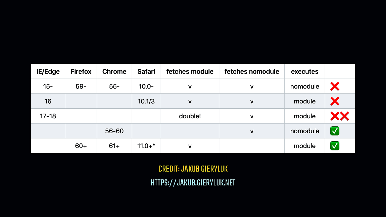
CREDIT: JAKUB GIERYLUK HTTPS://JAKUB.GIERYLUK.NET
Depending on the browser, both bundles can be downloaded. Worse yet, in select cases, both bundles can parse, compile, and execute both bundles. This is where you have to make a judgement call. Because the majority of your users are likely to be on new, evergreen browsers that don’t have this problem. Do you allow those on older browsers to take the hit, knowing the benefit will be enjoyed by the majority of your users? Or do you try to solve the problem so scripts are delivered efficiently for everyone? It’s your app, so it’s your call.
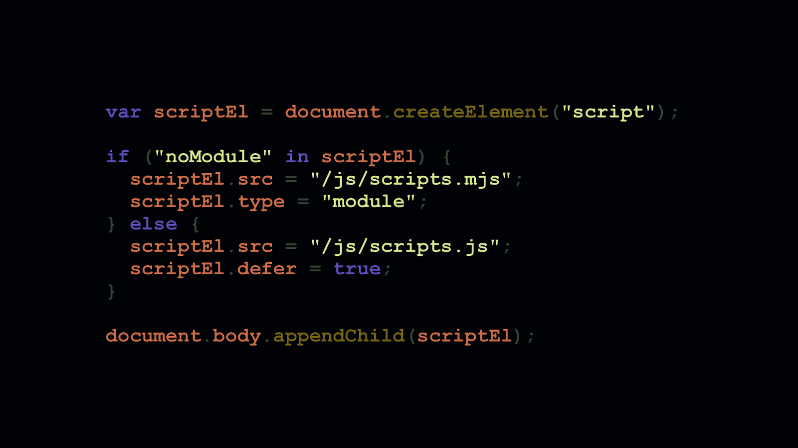
var scriptEl = document.createElement(“script”); if (“noModule” in scriptEl) { scriptEl.src = “/js/scripts.mjs”; scriptEl.type = “module”; } else { scriptEl.src = “/js/scripts.js”; scriptEl.defer = true; } document.body.appendChild(scriptEl);
But if you find double downloads to be unacceptable, there’s another way—though it’s more of a workaround. Here in this example, you can see we create a <script> element, and infer type=module support by checking to see if the browser supports the nomodule attribute. If it does, we can inject a script that points to a modern bundle. If not, we inject a script that points to a legacy bundle. I’ve used this pattern for a recent client of mine, which is a large electronics retailer. It ensures scripts get delivered without double downloads. This is particularly important for them, because their in-store kiosks use IE 11, and will continue to for the foreseeable future. For them, performance is crucial in this setting, so double downloads are unacceptable.

THIRD PARTY CRASHER
Of course, not all of our JavaScript woes are in our app code. Third party JavaScript is a real problem, and for some, it’s a bigger problem than application code.
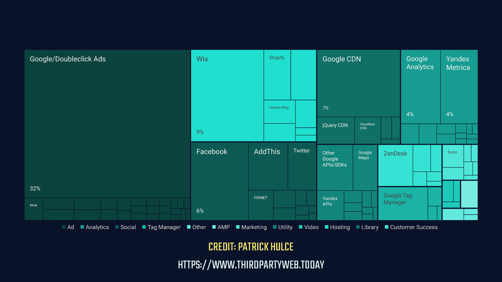
CREDIT: PATRICK HULCE HTTPS://WWW.THIRDPARTYWEB.TODAY
This is a visualization of the performance impact of third party code by Patrick Hulce. The analysis is done using data from the HTTP Archive, which contains data on 4 million sites. The message here is simple: Every third party utility, advertising partner, tag manager, and so on has a performance cost.

Aside from the overhead third parties add, one of the most damaging things they do to performance is that every unique origin requires a new connection to be opened to it. This is a three part process: - A DNS lookup must be done to find that third party origin server’s IP address. - A connection then must be established to that third party’s server, which is still done mostly over TCP. - And most of the time, we must open a TLS connection to that origin over HTTPS for security. This adds up to a lot of time people spend waiting for pages to become interactive. Or, arguably worse, a lot of stuttering, low FPS experiences on devices that frustrate people as they try to use your site. The more third parties we add to our application, the more this effect is multiplied.
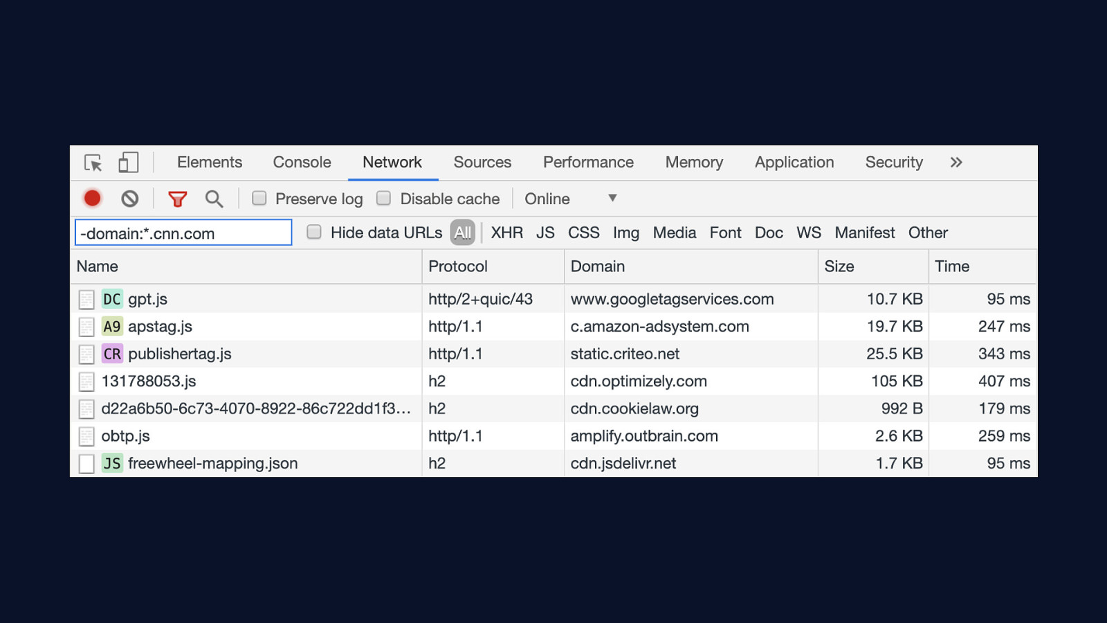
If you want to get a quick idea of how many third party servers are a part of your’s site overall performance picture, you can use this convenient little trick. In the network panel of Chrome’s DevTools, you can filter the list by domain. Using CNN’s website as an example, we can filter the list of resources to only third parties by removing all non-cnn.com domains. You can also turn on third party badging in the DevTool’s command palette with the Command+Shift+P shortcut, which will identify third party resources with a little badge like you see in this screenshot.
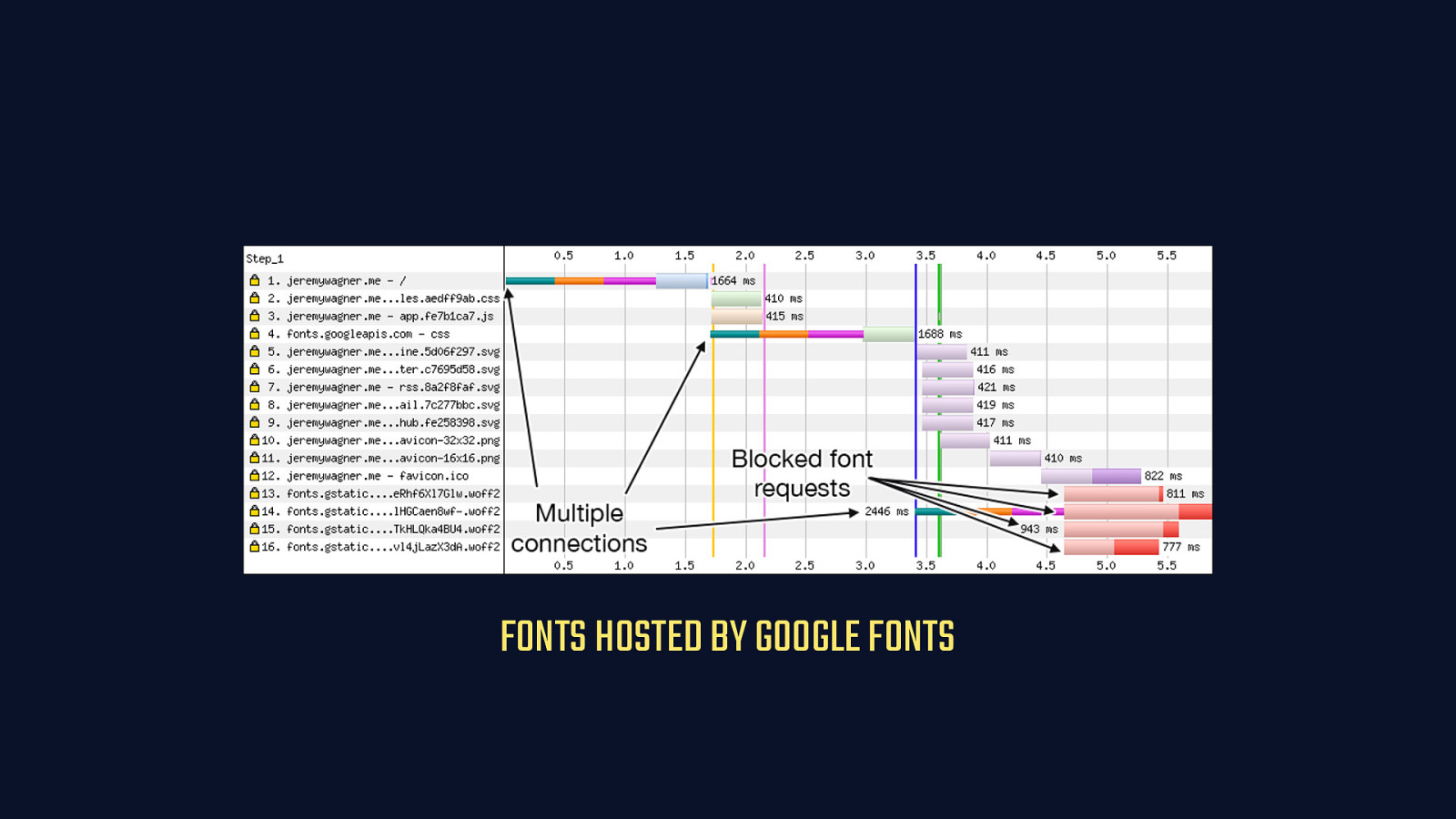
FONTS HOSTED BY GOOGLE FONTS
Using Google Fonts as an example, here’s how a single third party can significantly impact performance. In this WebPageTest timeline, here’s a relatively small site that’s held up from fully loading and rendering text because the browser is forced to wait while fonts are retrieved from Google Fonts. You’ll notice that DNS, TCP, and TLS time for two domains really holds up the show. Fonts don’t begin to start downloading until after 4.5 seconds in. They finish at over 5.5 seconds. For a small site, that’s a long time to be waiting for web fonts, which delays rendering of text by default.

SELF-HOSTED FONTS
The solution is to self-host. When you self-host third party resources, you eliminate connection latency to other origins by eliminating them entirely. Here, you can see that the only connection we open is to the primary origin—this is a connection we can’t avoid. Our content needs to live somewhere. But by cutting Google Fonts out of the picture and self-hosting those resources, we can get fonts downloaded on the client inside of 3.5 seconds. That’s a major improvement.
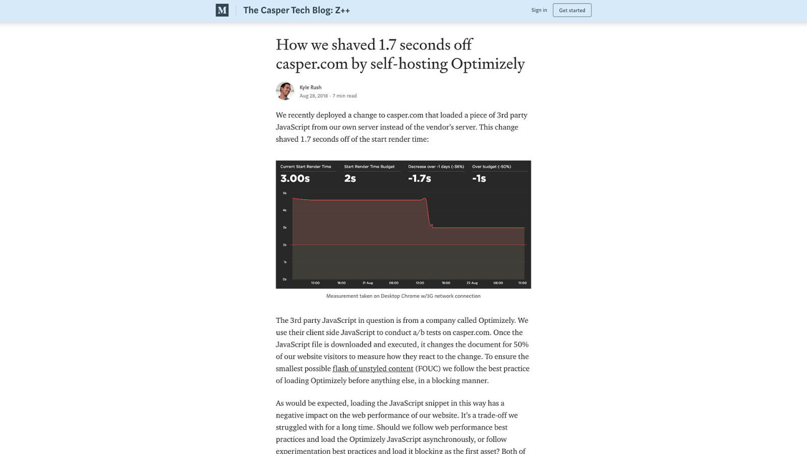
Aside from auditing your third party code and eliminating what you truly don’t need—and you should be doing that anyway—you can extend the idea of self-hosting third party assets to most things. The benefits of doing this are significant, especially where JavaScript is concerned. Optimizely is a popular client-side A/B testing product. My clients use it, sometimes to my chagrin, but it’s clearly useful to them. The ideal option would be to perform such tests on the server side and avoid loading a large chunk of client-side script to do this work. But that’s not always possible. In this example, Casper was able to reduce start render time by 1.7 seconds by self-hosting Optimizely’s JavaScript. It was an involved process to accomplish this, but the results were worth it. Self host as much third party code as you reasonably can.
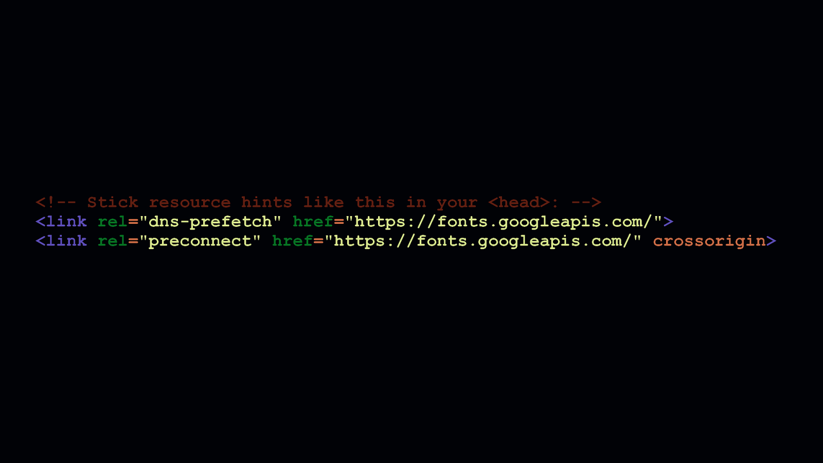
But, it’s not always possible to do so. In such cases, you can use the dns-prefetch and preconnect resource hints to perform DNS lookups or open connections to third party origins as soon as possible. This masks the latency of those third party calls, to one degree or another. I’ll be direct: this won’t be as beneficial as self-hosting those assets, but it can take some of the sting out of the performance impacts third parties can have on your site.

BE ACCOMMODATING
Of course, this leads us into a discussion about what it means to be accommodating. [SHOW TITLE CARD] - When we create something and slap it up on the web, we have to be a steward of that thing, and try our level best to make it usable for as many people as possible.
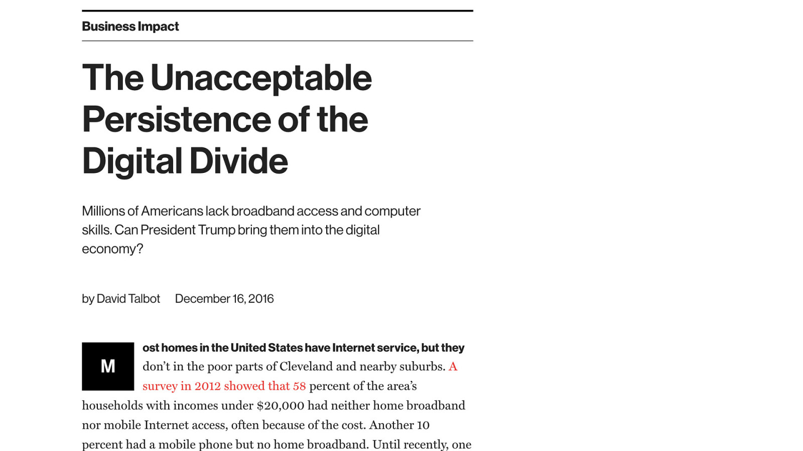
In The United States, many developers live in large cities, which are typically well-served by low latency, high bandwidth broadband and mobile internet connections. But a large portion of the country’s population lives in remote and/or underserved areas where this isn’t the case. This writeup by the MIT Technology Review revealed that 58 percent of households in the Cleveland metropolitan area with incomes under $20,000 had no internet access at all. These are people who typically rely on mobile internet connections—often with data caps—to function in an increasingly internet-dependent society.

Even more striking is this passage, which reveals that Pew Research found that fully one thirds of American adults don’t have an internet connection faster than dialup in their homes. I sincerely doubt this picture has improved significantly since the article was written. The infrastructure just isn’t there yet to bring these homes into the 21st century.

This broadband map of Buffalo County, Wisconsin, the state just east of where I live in Minnesota, is a microcosm of what rural broadband is like in America. If you happen to live near a population center, broadband infrastructure is a thing. But once you start getting out in the sticks, broadband starts to look less and less like an option. Until in some areas, it’s not an option at all.

PHOTO CREDIT: BAS VAN SCHAIK
The two elements of network performance are latency and bandwidth, and if you’re serving a lot of assets on your site, high latency or low bandwidth can make your site functionally inaccessible. Thankfully, there’s a technology supported in Chrome and derived browsers called client hints.

RTT Downlink ECT
Client hints are a technology that help developers to understand characteristics of both a person’s device and the network it’s connected to. There are a lot of client hints, and all of them can used to improve performance, but the three I feel are most useful are… [SHOW RTT] - RTT, or Round Trip Time. [SHOW Downlink] - Downlink. [SHOW ECT] - And ECT, or Effective Connection Type.
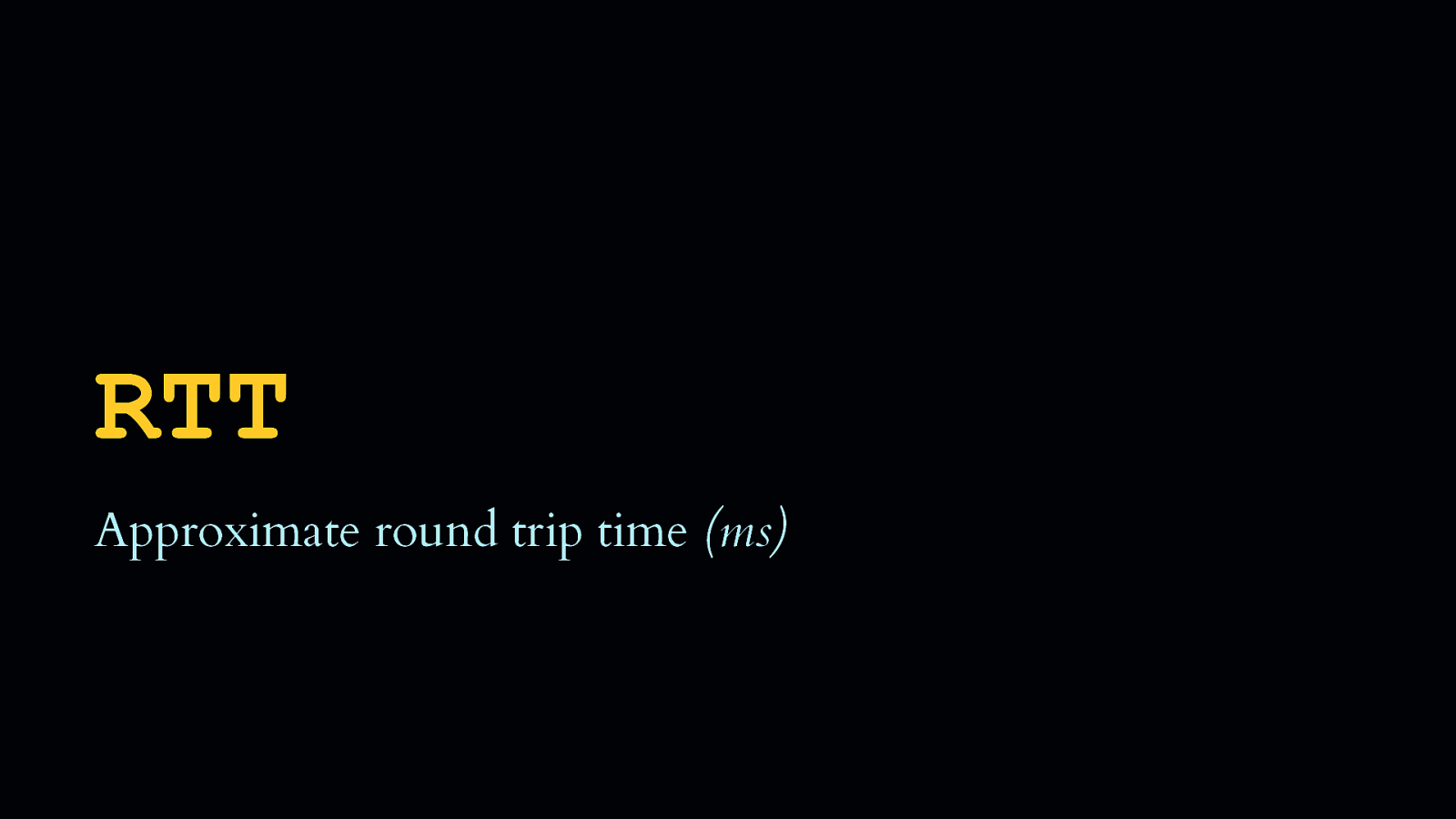
RTT Approximate round trip time (ms)
- RTT is the approximate latency a user is experiencing in milliseconds.

Downlink Approximate download speed (kbps)
- Downlink is the approximate downstream bandwidth in kilobits per second.

ECT Effective connection type (“4g”, “3g”, “2g”, “slow-2g”)
- And ECT, or Effective Connection Type, is an enumerated string determined by the browser after it examines the RTT and Downlink and attempts to categorize the user’s connection based on that information.
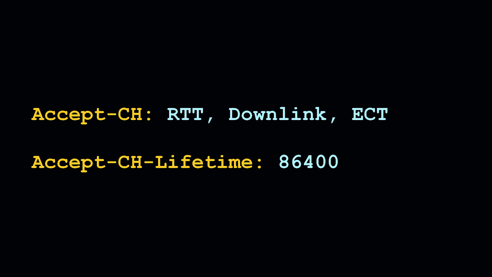
Accept-CH: RTT, Downlink, ECT Accept-CH-Lifetime: 86400
All of these client hints can help us to tailor experiences to send less stuff to people if they’re on slow connections. We can opt into hints using the Accept-CH HTTP request header. [SHOW Accept-CH] - And we can tell the client how long we want this information to be accessible to the client using the Accept-CH-Lifetime header. [SHOW Accept-CH-Lifetime] - In the above example, we persist these client hints for a day, but you can supply whatever value you think is appropriate.

You can use these hints in a server-side language—like PHP as we see here—to access these hints when they come through as request headers. In this example, you can see that we initialize a variable with a default effective connection type of ”4g”. We do this in case a browser comes along that doesn’t support client hints, so we assume a default fast connection speed. Then, we check if the ECT hint has been sent as a request header. If so, we then store that header’s value in the ECT variable.
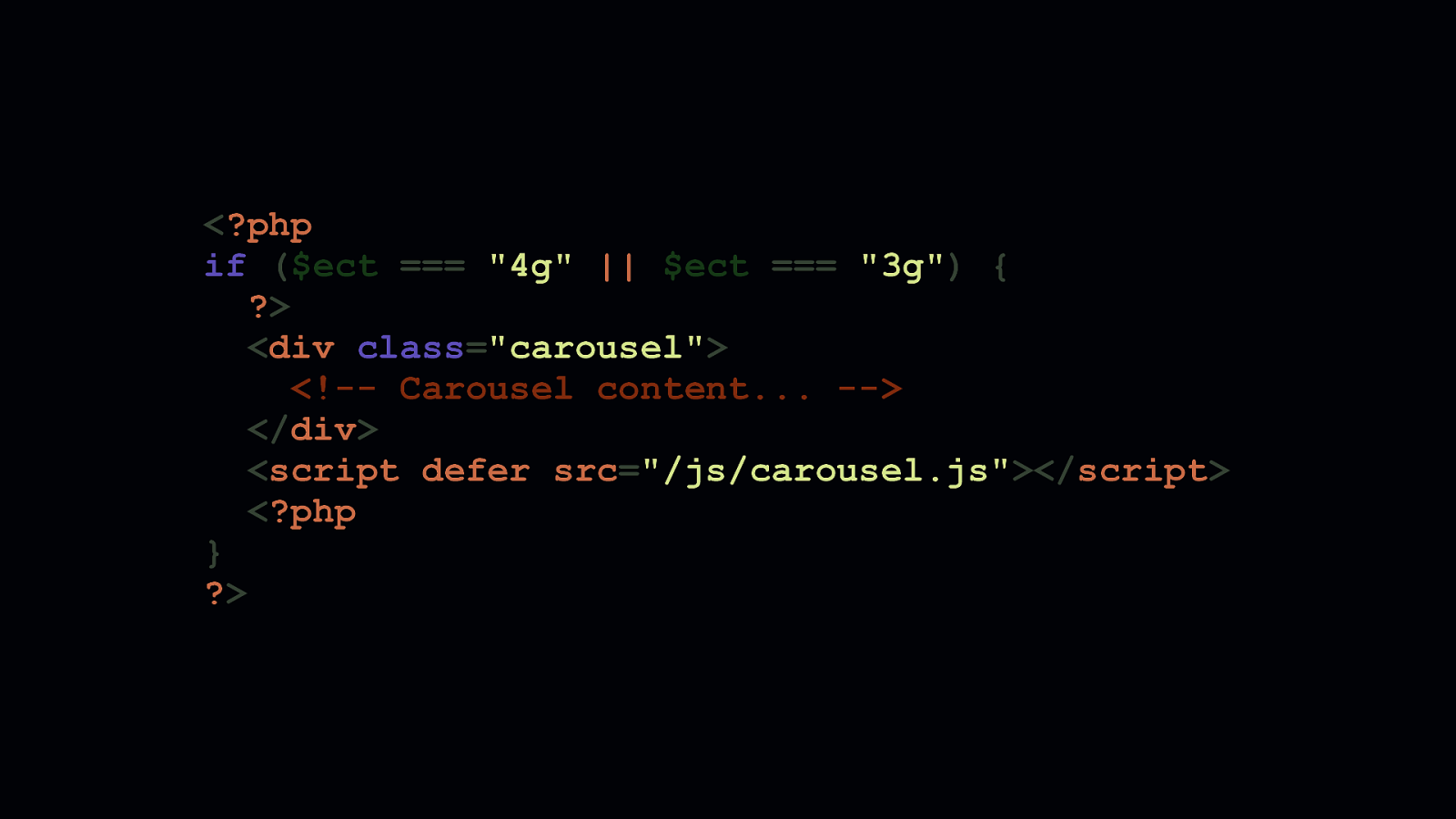
Using this information, we can shape the experiences we create to adapt to the conditions of the network or device accessing them. This is a powerful technology that allows you to create lighter, more focused experiences for the people who really need them. In this simple example above, we decide that a person will only see a data-intensive carousel if a person is on a fast connection. If a user is on a slow connection, their experienced is lightened with an increased focus on content that is critical to them.

ADAPTIVE PERFORMANCE
- I like to call this “Adaptive Performance”. And I think it’s a fantastic way of compromising between the ideal experience you as a developer worked so hard to build, and an experience that’s more inclusive and accessible to those who maybe otherwise couldn’t access the ideal one you had in mind.

22 REQUESTS, 740 KB 91.26 SECONDS OVER 2G
5 REQUESTS, 12 KB 5.17 SECONDS OVER 2G And it works! Here you can see two versions of the same site. The site on the left has custom fonts, a carousel with images, accordions, and plenty of JavaScript to run all of it… [SHOW STATS] - …which is pretty much unusable on a slow connection. - But, using client hints, we can distill this experience down its core for those on slow connections. [SHOW STATS] - And for our trouble, those people will have something they can access quickly, even if bandwidth is lacking and latency is very high.

- If you’re interested in learning more about client hints, you can see a video on YouTube of a presentation I gave at Full Stack Fest last year that goes in depth on client hints.
- Or, if you’re more the type to read stuff rather than watch videos, you can check out this guide I wrote for Google that explains them in similar depth.
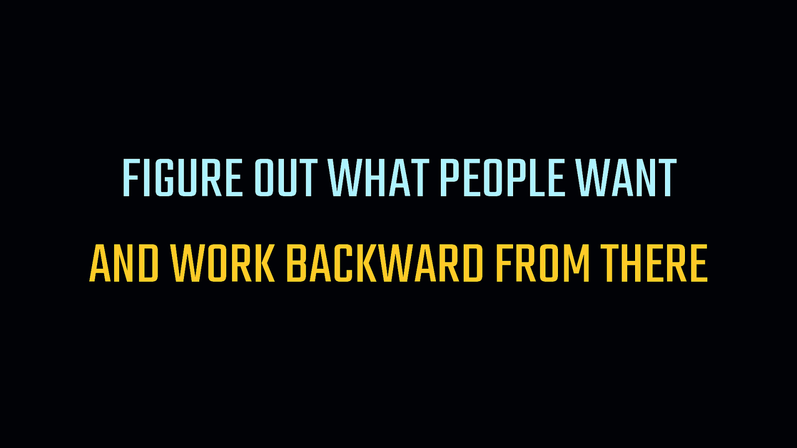
FIGURE OUT WHAT PEOPLE WANT AND WORK BACKWARD FROM THERE
In closing, I want to hit on what I think is an extremely important point. [SHOW TOP LINE] - Which is that we need to first understand what it is that people want from the things we put on the web. Meaning, what do they want to do when they navigate to our site? [SHOW BOTTOM LINE] - Then we need to work backward from there and build something that serves that purpose with precision and care.

Any person in almost any profession loves their tools. They enable us to be craftspeople. Developers are no different. We love the tools that are available to us. We take pride in building great things with them. But unlike, say, the auto mechanic who fixes your car, the tools we choose to do our work have a direct and felt impact by those who use what we make. We don’t always need to burden them with the entire toolchest.

Sometimes it makes more sense to use tools that are smaller and more focused on the actual work. That is to say, your experience as a developer is important, but it is never more important than the user’s experience. If your excitement for a certain set of tools causes you to build things that no longer efficiently serve the purpose you set out to fulfill, it’s time to re-evaluate them.
- Thankfully, the ecosystem gives us a lot of options without sacrificing developer experience entirely.
- You can always find smaller options that will be felt less by the people who use your creations.
- Time and time again, if you look, you can find alternatives to commonly used libraries and frameworks…
…so hopefully you can use less JavaScript, use it more responsibly and with care. [FADE SCREENSHOT] - And my hope is that slowly, over time, we can all learn to do more with less JavaScript—or perhaps even recognize when we don’t need it—so we can create resilient, fault-tolerant sites that are faster and more accessible for everyone, everywhere.

THANK YOU JEREMY WAGNER — @MALCHATA — JEREMY.CODES
Thank you!

RESOURCES RESPONSIBLE JAVASCRIPT: PART I alistapart.com/article/responsible-javascript-part-1/ HYBRID LAZY LOADING: A PROGRESSIVE MIGRATION TO NATIVE LAZY LOADING smashingmagazine.com/2019/05/hybrid-lazy-loading-progressive-migration-native BUNDLEPHOBIA bundlephobia.com BABEL 6: LOOSE MODE 2ality.com/2015/12/babel6-loose-mode.html HTTP ARCHIVE httparchive.org THIRD-PARTY WEB thirdpartyweb.today WEBPAGETEST webpagetest.org HOW WE SHAVED 1.7 SECONDS OFF CASPER.COM BY SELF-HOSTING OPTIMIZELY medium.com/caspertechteam/we-shaved-1-7-seconds-off-casper-com-by-self-hosting-optimizely-2704bcbff8ec PAINT THE PICTURE, NOT THE FRAME: HOW BROWSERS PROVIDE EVERYTHING USERS NEED alistapart.com/article/paint-the-picture-not-the-frame THE UNACCEPTABLE PERSISTENCE OF THE DIGITAL DIVIDE technologyreview.com/s/603083/the-unacceptable-persistence-of-the-digital-divide QUICKLINK github.com/GoogleChromeLabs/quicklink TAKE A (CLIENT) HINT! youtube.com/watch?v=md7Ua82fPe4 DNSTRADAMUS github.com/malchata/dnstradamus ADAPTING TO USERS WITH CLIENT HINTS developers.google.com/web/fundamentals/performance/optimizing-content-efficiency/client-hints

While the performance of JavaScript engines in the browser have seen continued improvement, the amount of JavaScript we serve increases unabated. We need to use JavaScript more responsibly, which—in part—means we must rely on native browser features where prudent, and know when too much JavaScript is just that: Too much.
In this talk, we’ll explore what happens to performance and accessibility when devices are inundated with more JavaScript than they can handle. We’ll also dive into some novel techniques you can use to tailor delivery of scripts with respect to a user’s device capabilities and network conditions. When you walk out of this session, you’ll be equipped with new knowledge to make your sites as fast as they are beautiful.
 for free. You
can too.
for free. You
can too.
Resources
The following resources were mentioned during the presentation or are useful additional information.
-
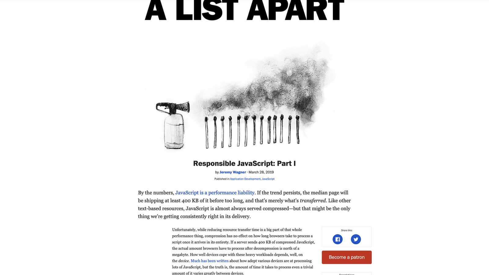
Responsible JavaScript: Part I
The web is drowning in a sea of JavaScript, awash with unnecessary bloat, inaccessible cruft, and unsustainable patterns. Jeremy Wagner plots a course to navigate the JavaScript Sea responsibly by building the right things the right way and using the web platform the way it was meant to be used.
-
Bundlephobia
-
HTTP Archive
-
WebPageTest
-
Paint the Picture, Not the Frame: How Browsers Provide Everything Users Need
Designers want to create fully branded experiences, which often results in customized highlighting colors or pixel-perfect typography. While these design touches can enhance the experience for some, they can render the experience inaccessible for others. Designer Eric Bailey makes a case for leaving key accessibility features to the browser to ensure the most accessible experience possible.
-
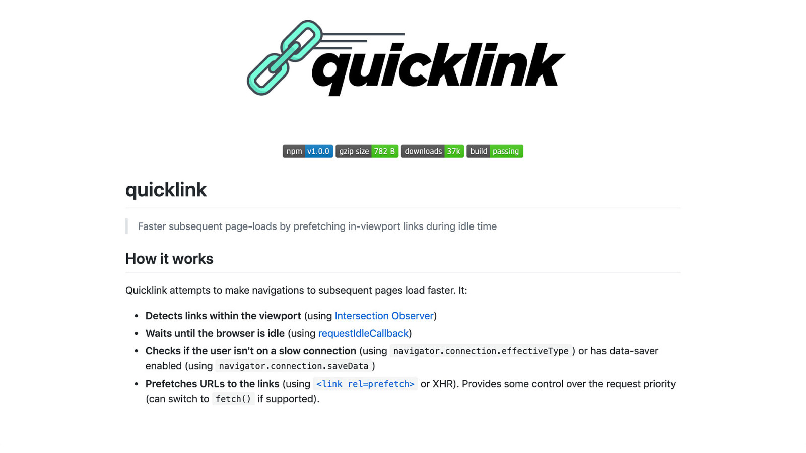
quicklink
Faster subsequent page-loads by prefetching in-viewport links during idle time.
-
dnstradamus
A prognosticating script that prefetches DNS information for outbound links.
-
Hybrid Lazy Loading: A Progressive Migration To Native Lazy Loading
Native lazy loading is coming to the web. Since it doesn’t depend on JavaScript, it will revolutionize the way we lazy load content today, making it easier for developers to lazy load images and iframes. But it’s not a feature we can polyfill, and it will take some time before it becomes usable across all browsers. In this article, you’ll learn how it works and how you can progressively replace your JavaScript-driven lazy loading with its native alternative, thanks to hybrid lazy loading.
-
Babel 6: Loose Mode
Babel’s loose mode transpiles ES6 code to ES5 code that is less faithful to ES6 semantics. This blog post explains how that works and what the pros and cons are (spoiler: normally not recommended).
-
Third-party Web
-
How we shaved 1.7 seconds off casper.com by self-hosting Optimizely
We recently deployed a change to casper.com that loaded a piece of 3rd party JavaScript from our own server instead of the vendor’s server. This change shaved 1.7 seconds off of the start render time.
-
The Unacceptable Persistence of the Digital Divide
Millions of Americans lack broadband access and computer skills. Can President Trump bring them into the digital economy?
-
Take a (Client) Hint!
-
Adapting to Users with Client Hints
Developing sites that are fast everywhere can be a tricky prospect. The plethora of device capabilities—and the quality of the networks they connect to—can make it seem like an insurmountable task. While we can take advantage of browser features to improve loading performance, how do we know what the user’s device is capable of, or the quality of their network connection? The solution is client hints!